While increasingly more companies embrace email marketing, one thing that tends to be overlooked is email marketing accessibility. However, we’ve also noticed that email marketing accessibility is getting recognized as a necessary, good email marketing practice by many email marketers, designers and developers. Today, we’d like to talk more about accessibility in email marketing: we’ll give you some tips on creating more accessible emails.
What is Email Accessibility?
Email marketing accessibility refers to emails that all recipients can understand, regardless of disability. And your email subscribers could have different types of disability – affecting their vision, mobility, hearing or cognitive skills and more. Some of your email recipients could be using assistive technology to read your emails, for example, utilize the screen readers. So, in fact, building accessible emails is basically building inclusive emails.
How Can You Make Emails More Accessible?
Let’s find out what you can do to make your emails more accessible. And yes, there are several things you can start doing right away to be more inclusive.
1. Larger font size and healthy paragraph spacing
It’s recommended to use a font size of 14 – 16 pixels; this way your text size will be more user friendly and comfortable to read, especially on mobile devices, where the font can appear smaller. Moreover, paragraphs should have healthy spacing around it – try to make it easy to identify where one paragraph ends and another begins.
2. Logical reading order
Try to maintain a logical reading order. It especially matters if you’re using a multi-column approach – code the tables properly. It makes a difference – for example, a screen reader will read each cell in your table from left to right, and from the top of the table to the bottom.

3. Set a language attribute
By setting the email language, you’re directing the screen readers and other assistive devices to display/pronounce your email in a specific way. For example, if you’re using code lang=”en” in the head of your email, then assistive technology can recognize that the email is written in English.
4. Set the title and headers
Correctly used title <title> and header tags such as <h1> and <h2> can help users with assistive devices and screen readers. It’s a better way to emphasize or help identify certain sections in your email than simply using “bolded” text.
5. Use alt-text
Alternative text or alt-text is the text that we set to appear when images are turned off or do not load/display. You should know that the screen readers can read alt text too! So, whenever you’re using images in your email, think about what alt text to add to make your email inclusive and understandable to all.
6. Left-aligned content is the easiest to read
Try to use left-aligned text more – it has been proven to be the easiest to read. “Justified” text means that letter/word spacing is adjusted to equally fit between left and right margins, but it can also make it more difficult to read for some of your subscribers. Similarly, the center-aligned content could be challenging to read, especially for email recipients with dyslexia.
7. Colour contrasts
Poor colour contrast can make it difficult to understand your email, especially for people with color blindness. The Web Content Accessibility Guidelines (WCAG) outlined a series of recommendations for text contrast on the web, and these can and should be used for email marketing. Here’s a good resource from WebDev.ink about text contrast for accessibility.
8. Test your emails
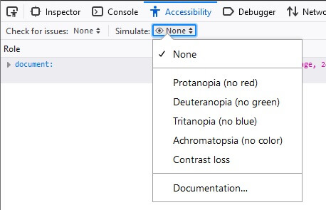
Before launching an email campaign, why not try to test the accessibility of your email? View your email with images on and off. You can also use a screen reader to read your test email or run a colour-blind test or accessibility simulations. There are many tools out there to help you test accessibility. For instance, if you open your email in Mozilla Firefox, you can run different simulations there too:

Email Accessibility = Email Inclusivity
We’ve looked at various ways to help you make your emails more accessible. There are many different steps to improve the user experience from accessibility point of view: using good color contrasts, having good title and header tags in the code, setting the email language, adding proper alt-text descriptions and many others. Therefore, next time you’re planning your email, try to take these few extra steps to make your emails more inclusive to all subscribers.
