Businesses across many industries use various ways to schedule appointments with their clients. Sending out appointment confirmations is a good business practice. It demonstrates that you value your clients and their time. Also, you are using the opportunity to remind them about the scheduled appointment. The “no-shows” are bad for any business, but they can especially hurt SMEs. Research done by 10to8 estimates that companies with monthly revenue of $10,000 could lose as much as $26,000 yearly because of missed appointments. Thus, let’s take a closer look at appointment confirmation emails.
Appointment Confirmations: Expected and Welcomed Emails
There are different types of confirmation emails – appointment, order, shipping or delivery confirmations, reservations, subscription confirmations, and many more. In general, all kinds of confirmation emails are very welcomed by email recipients.
According to the Conversionxl blog, an Experian study found that, on average, confirmation emails get about five times higher engagement rates than the general bulk email deployments. Higher engagement rates include clicks and opens, transactions, and even revenue-per-email rates. That is to be expected from appointment confirmation emails as well, as they are triggered by users’ actions.
The Main Elements of a Good Appointment Confirmation Email
When you plan your appointment confirmation email, you need to think about the following aspects carefully:
Branding
Your email templates should be in sync with your brand and marketing guidelines. Consider the colors, fonts, font sizes, images and logos, and even your email tone of voice. Well-designed confirmation templates can enhance the overall look and feel of your emails for your appointments.
Body copy
This email needs to be clear and easy to read. You don’t want to turn it into a newsletter or another promotional email. The purpose of this email is to confirm and remind the recipient to show up.
Make sure you add the following information to your body copy:
- The time and date of the appointment
- The duration of the appointment
- A person or people that the appointment was scheduled with
- The location, ideally with a link to a map
- The contact number or email address for more information
Your calls-to-action
Think about what types of calls-to-action work best for your business. Are you using buttons, or does your audience get more engaged with simple hyperlinks? How many CTAs are you going to include? Which one is your main one? Where are you going to position them? Which brand color will you use for your primary CTA? What about the secondary calls-to-action?
Add to calendar options
Appointment confirmation emails should contain a way to add this event to the recipient’s calendar. The most widely used method of doing that is including an .ics file. That is a standardized calendar file format that includes all the event information. Thus, once added, the recipients’ calendars will issue reminders, too, helping you reduce the rate of no-shows.
A way to make changes to the appointment
Your clients might need to make changes to the appointment, especially if they have booked quite far in advance. Therefore, it’s a very user-friendly practice to add a way for them to painlessly make the required changes or even cancel the appointment altogether. If you have an appointment cancellation or rescheduling policy, such as cancellation fees or a timeframe needed for any changes, add this information too.
Make The Appointment Confirmation Emails Fit Your Business
You can find some handy screenshots of appointment confirmation emails on the Really Good Emails platform, and we will take a look at some of them now.

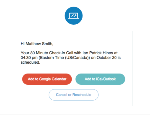
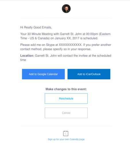
The two Calendly emails are good examples of how to design a very clean and tidy appointment confirmation email. A logo or a personal photo is added to the top of the email to ensure a visible branding element. Take note of the personalized salutation in both emails too. They’ve also added all the information about the appointment in a short and easy-to-scan way.
What about the calls-to-action? The main ones are in color – the add to calendar buttons. There’s also a third and even a fourth CTA, which is the cancel or reschedule button, allowing their recipients to make changes to the appointment.

The companies are using their secondary-level CTAs well. They have selected lighter borders and fonts – visible enough to be noticed and still readable. Moreover, they don’t take the attention away from the main call-to-action buttons (the add-to-calendar ones).
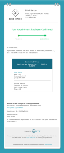
Here’s another example -appointment confirmation from Haircut at Blind Barber, also showcased by the Really Good Emails. This email, compared to the previous ones, has more branding elements. It is an excellent showcase of a longer appointment confirmation email. More design elements, nicely designed email borders – email fits their industry well.
Their logo is placed on the left-hand side, the top of the email. The company information is nicely aligned next to the logo. Research shows that we tend to scan emails in an F-shaped pattern, with more attention on the left-hand side of the email. Thus putting your logo and other information that you want to be noticed on the left of the email is worth an A/B test.

This email also confirms that the appointment status has been changed from pending to confirmed. Again, the personalized salutation makes the email more friendly and targeted. After that, we have all the necessary information about the appointment itself.
We would recommend including the add to calendar option as a link instead of an attachment. There are many reasons why you should avoid attachments; for instance, attachments can easily become a reason for your email being marked as spam. They can also make your email too large, as naturally, they will increase the email size.
Reduce Missed Appointments with Your Appointment Confirmation Emails
Appointment confirmations can make a big difference to your business by helping you to reduce your missed appointment rates. And thus, bring more potential revenue to your company. When you’re planning your email, spend some time designing it to ensure a smooth user journey to your email recipients. Whether they want to add the event to their calendars, reply to the email or even make changes to the appointment itself.
What to keep in Mind:
- Don’t underestimate the readers’ first impressions.
- Send highly targeted emails.
Next: Email Marketing Lessons from Realtors
Did you know that around 2.5 billion people use email around the world? That number is only expected to go up. A top real estate investor Corey Tyner writes in our next blog post about Email Marketing lessons that he has learned during more than a decade in Real Estate marketing.
Make sure you check our blog regularly, and don’t forget to subscribe to our emails. Or you may want to follow up on the last blog post on How SMS Marketing Fits into Your Email Marketing Strategy if you’ve missed it.
