Marketing email design is something that marketers always try to improve – make the emails look beautiful, professional, and engaging. We analysed many marketing emails. Indeed, there are some popular design trends that email marketers are choosing when they are creating emails. Let’s take a look at some of them.
Pastel Colors in Marketing Emails
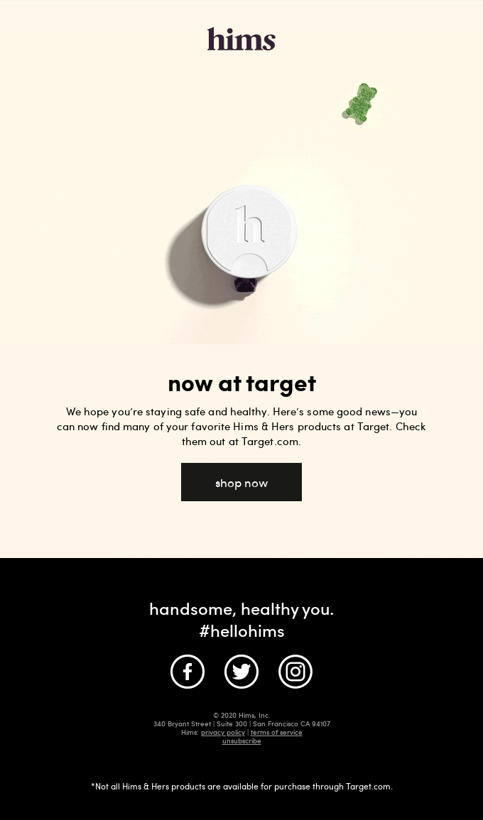
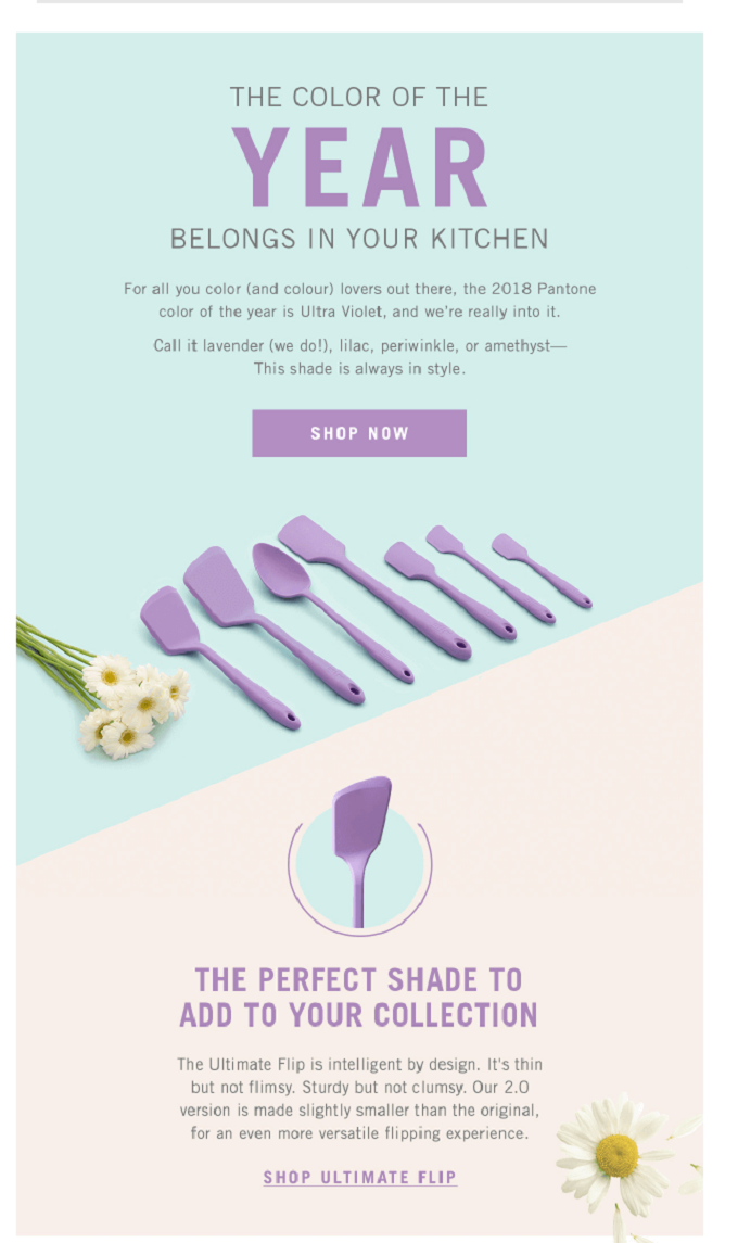
We have discovered that many recent marketing emails have pastel colors. They are often used for backgrounds or main (hero) banners. What are the pastel colors? Canva describes pastels as pale tones of colors, where a significant amount of white is mixed into the original shade. They are usually seen as soft, light, or pale colors.
Moreover, they are often associated with positive emotions such as calmness or lightness, and even with spring and summer seasons. It looks like many marketers chose to portray these emotions in their emails. Check out these examples.
Embrace the Dark Colors
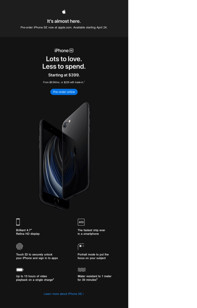
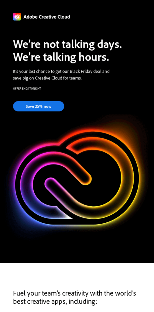
While many marketers were choosing light shades and pastels, others have embraced the dark colors and dark backgrounds in their emails. Dark backgrounds can be very beneficial if you want to achieve a good contrast or highlight a particular design element.
However, if the emails are too dark and with not much contrast, email accessibility and readability can be reduced. We have found some interesting email examples from Apple and Adobe Creative Cloud. Apple marketing email is predominantly dark – the dark background is used throughout the email. It also features a black iPhone image. White text is used to achieve more contrast.
Adobe Creative Cloud used a black background for their main header, and it was a great decision as it matches the email’s goal. It’s a Black Friday marketing email, so a black hero banner definitely fits well.
Geometric Shapes: Colorful and Fun
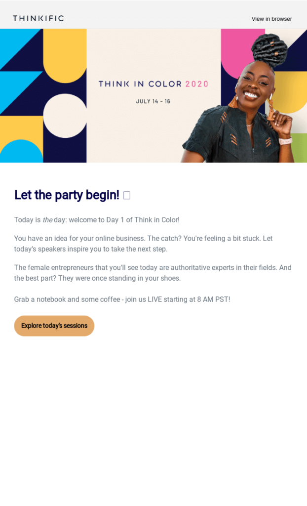
This time, we will take a look at the designs with geometric shapes. Geometric shapes are generally paired with bright and lively colors. We found some great email examples with geometric shapes.
The email from Headspace has lots of them – they are colorful, and well, happy. In the second example, the Thinkific header banner also brings shapes and color into their design – again, it communicates happiness. Pair it with the main headline “Let the party begin”, and you’ll have a powerful combination.
Photography is Still Popular, But It’s Different
Many marketing emails contain powerful photography. However, we’ve noticed that images with real human bodies are becoming more widely embraced. Natural bodies, less Photoshop – breaking long-standing beauty concepts. Girlfriend collective email is definitely all about that!
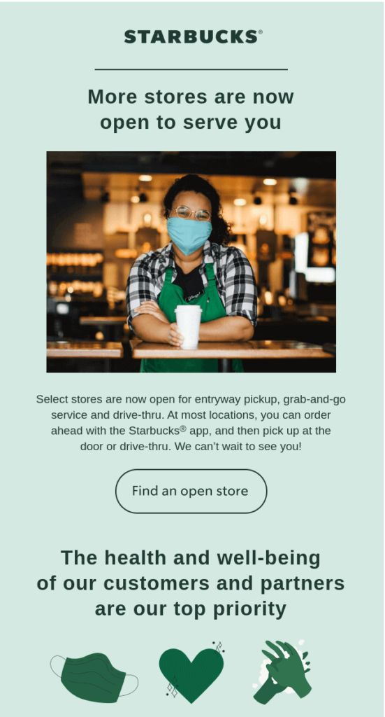
Another trend that we have noticed during the pandemic is that single people photographs are being used more than those portraying groups of people. Some marketers went a step further and included photos of people wearing masks.
Experimenting with Typography
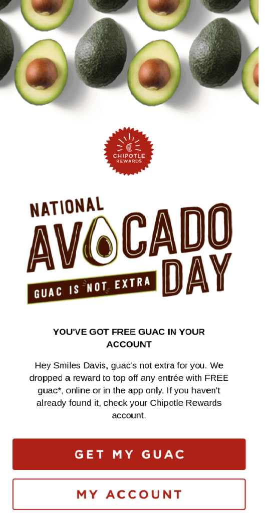
This is an entertaining trend – we’ve noticed quite a few marketing emails with fantastic typography. Well-planned creative typography and fonts can definitely liven up emails and grab attention.
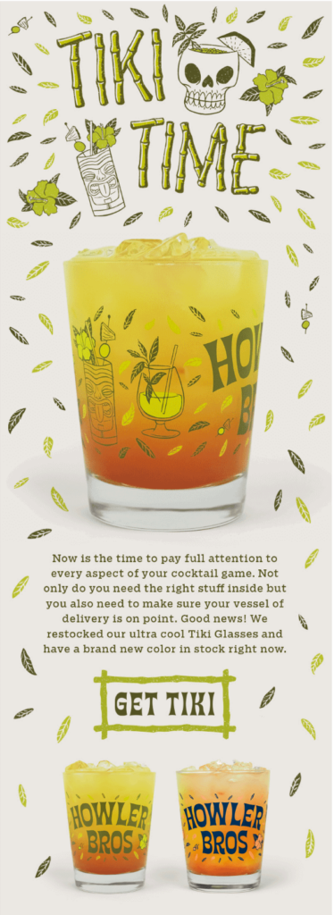
Take a look at the emails below. “National avocado day” with the avocado instead of the letter “o” – very smart! While sometimes it’s challenging to create fun typography and still have the words easy to read, this email has definitely nailed it. The Howler Brothers email is also a perfect example of great typography – letters made of bamboo sticks invite you to the “TIKI TIME”.
The Next Level Animated Gifs
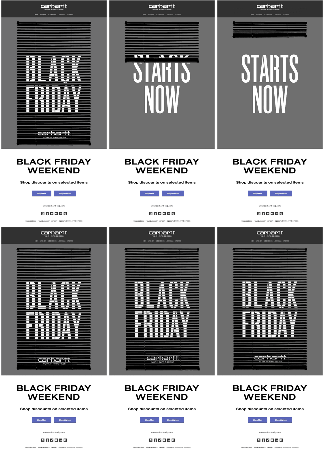
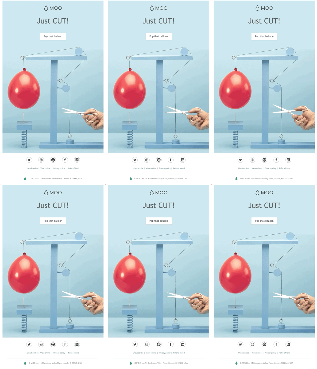
Last but not least, we want to highlight the perfectly crafted animated images in marketing emails. Companies are getting more and more creative with their animation in their emails. Animated gifs can definitely grab attention and make the emails much more engaging. Unfortunately, not all devices and email programs will display animated gifs. Therefore, when you use them, make sure the first frame shows the most important information because that’s what some of your email recipients will be able to see. We’ve found some fantastic email examples for you!
Creativity in Marketing Emails is Thriving
We’ve shown you some popular email design trends, and it’s safe to assume that marketing emails are getting more and more creative, beautiful and engaging. Marketers are becoming more innovative and brave with their designs, breaking the traditional rules and striving to engage the email recipients. We hope you enjoyed these email examples – let them inspire you to find creative ways to communicate your email messages to your subscribers.
