

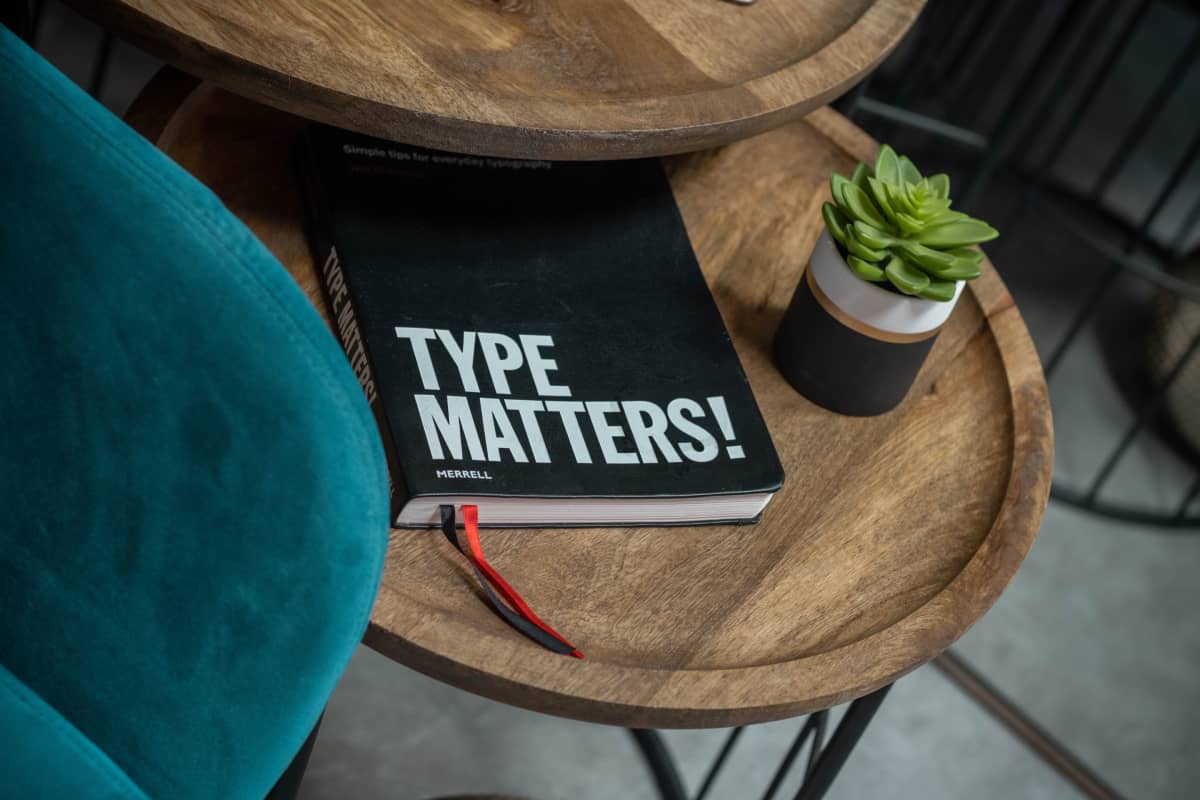
Typography is the art of creating and presenting written words: how you layout your text, its style, and the size. With the digitalization of marketing, typography has become very important for both online and offline mediums. So, this time, let’s take a quick look at typography in marketing emails. Is it something you should pay attention to?
Psychology of Typography
Researchers have explored the links between typography, consumer memory, and brand perceptions, where connections with semantic associations were found. For example, associations with elegance, gentleness, or novelty. If you’re looking to learn more, M.S. McCarthy and D.L. Mothersbaugh analyzed the effects of typographic factors in advertising-based persuasion. In addition, T. L. Childers and J. Jass further explored the typeface semantic associations.
Increasingly more businesses are adding email marketing to their marketing mix. It’s not a surprise that it’s a constant challenge for email marketers to compete for subscribers’ attention. Therefore, it’s up to marketers to find ways to stand out, grab attention, and get that desired email engagement. Thus, let’s further explore email typography: what can be done with typographic components to help build better, more engaging marketing emails.

Fonts in Email Marketing
Nowadays, there are so many fonts that designers can use. And, yes, when building emails, you can use various fonts too. But what’s the catch? Well, email marketers understand that it’s never that easy with email marketing. We can see a huge variety of beautiful, unique, creative fonts used online. But when we talk about fonts in email marketing, we need to understand the difference between web fonts and web-safe fonts.
Web Fonts
There are so many different web fonts available for online marketing; they can be really memorable and distinctive. Web fonts are usually stored online and acquired through such portals as Google Fonts or My Fonts. These custom web fonts require appropriate licensing, so they might carry some additional costs.
And even though you can build your emails with custom web fonts, in most cases, your email recipients will see the fonts that are available to them from their email clients. And while it’s tempting to use custom fonts, it’s safer to select the fonts that are compatible with the ones used by Outlook, Gmail, and other popular email providers.
Web fonts in emails can be considered as a “nice-to-have” rather than something you must have. Web fonts could potentially help enhance your email message, portray your brand voice better than web-safe fonts. Litmus has a great table detailing the support of web fonts in different email clients. But if you really want to go for a custom font, make sure you specify your fall-back options and test, test, test!
Web Safe Fonts
Web safe fonts usually look the same in your designed email, and the email opened in your subscriber’s inbox. These fonts exist on almost all devices and email clients. They include well-known fonts such as Times New Roman, Georgia, Arial, Helvetica, Verdana, and some others. These ones are most usually considered email-safe fonts too. So, if you use a custom font instead, it can fall back to a default font of the email client; for example, Gmail will use Arial or Apple Mail – Helvetica.
That said, even though they are considered safe fonts, not all will work well in emails – some fonts just aren’t easy on your eyes. They can be challenging to read and, therefore, could impact your email results (the same applies to custom web fonts!)
Things to Consider When Selecting a Font
When selecting fonts, think about your branding, your subscribers, and legibility. Different brands use different fonts. If you use web-safe fonts in your emails, try to identify which font is the closest match to the font of your brand. Keeping fonts consistent throughout all your emails can help build these semantic associations as your subscribers start to recognize the look and feel of your email messages.
Also, consider what your readers would prefer: what is your audience like? Is there a specific age group you’re targeting? Maybe this knowledge would impact the choice of fonts in your marketing emails. Remember, emails can be opened and read on various devices, from large desktop screens to tiny mobile phones. Does the font of your choice affect the legibility of your email? Can the subscribers effortlessly skim through the copy? Email fonts should be easy to read and display well across multiple devices and email clients.
You’re Not Limited to an Email Font
There’s no arguing that written text in emails is important. Some email clients will have images turned off by default, so it’s up to your text to drive that engagement. Well-planned typography in your marketing emails can encourage your subscribers to either download images or click on your call-to-action button (CTA).
And even if you use a web-safe font, it doesn’t mean that your email copy will not stand out. There are many other components you can consider:
- font-colour
- font-size
- font-weight
- cursive
- underline
- capitalization
- padding
- line-height
- letter spacing
For example, you can adjust the padding, line height, and even letter spacing. Try to find the right font size for your audience. Play with capitalization, underline, or bold keywords. Find colors that could enhance your email text. You can test and see what works best for your audience. That said, please don’t forget email accessibility and good color contrasts.

Don’t Underestimate Typography in Email Marketing
While typography is sometimes overlooked by marketers, the way you present your email text is as important as your email images. In some cases, the text is even more critical. When considering email fonts, don’t forget your audience’s preferences. Understand your demographics, but also try to stay on brand. And more importantly, make sure your text is easy to read. Use the power of typography; different fonts and font sizes, colors, line-heights. Typography is an art, and art can be subjective! Therefore, make sure to device-test and audience-test your emails to get the best results.