
Pantone is a global authority on color, known for creating a standardized color-matching system that is widely used in industries ranging from graphic design to fashion and print. Each year, the Pantone Color Institute announces its “Color of the Year” – a shade that is believed to capture the mood of the current moment, reflecting trends and cultural shifts. This selection often influences various design industries, from fashion to interior design, product development, and of course, marketing.
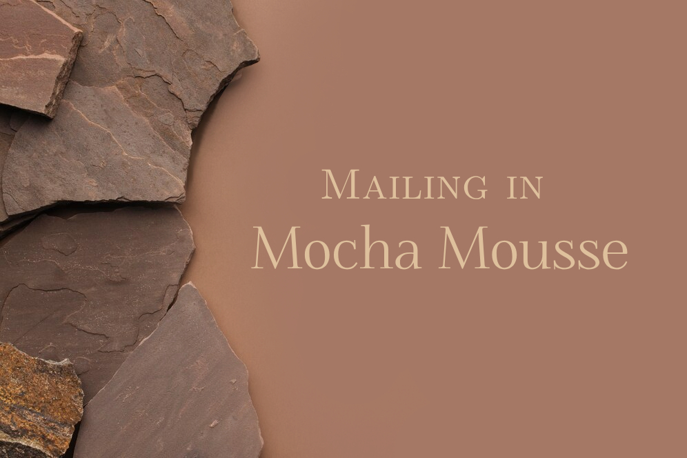
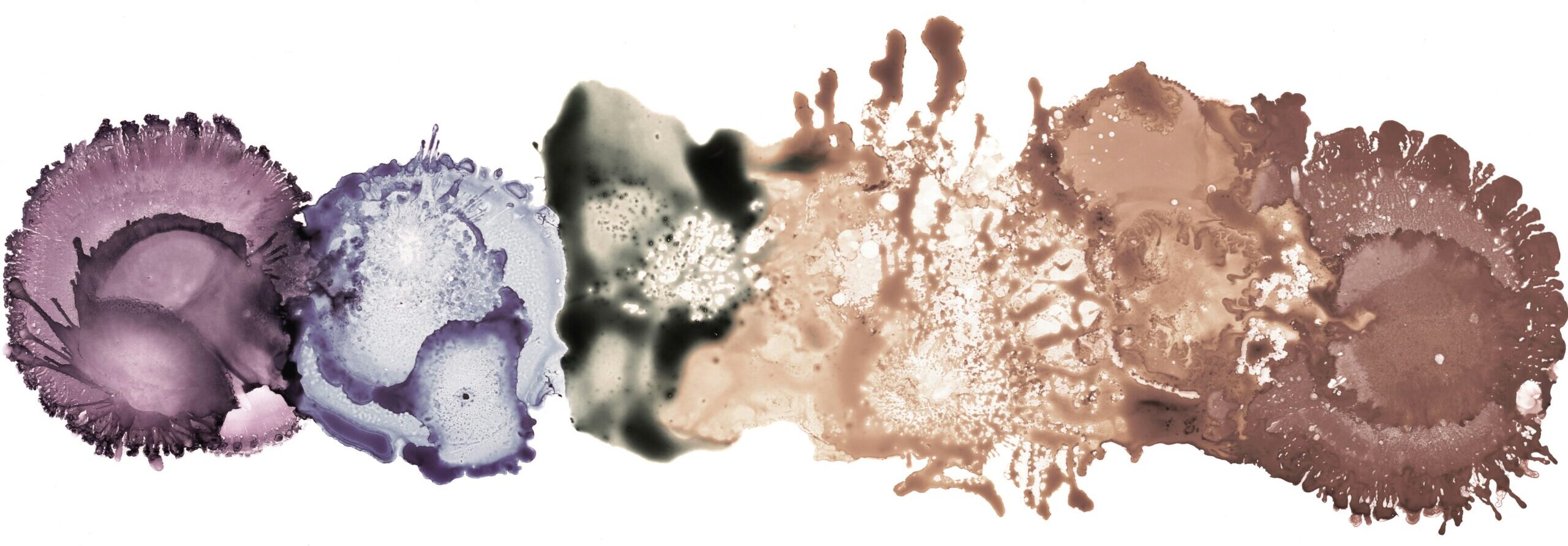
For 2025, Pantone has chosen Mocha Mousse – a deep and warming brown hue with hints of richness and sophistication – as its Color of the Year. Let’s explore how this earthy shade can be incorporated into email marketing campaigns to connect with your audience and elevate your brand’s messaging.
The Story Behind Pantone and the Color of the Year
Pantone, founded in 1962, is a global authority on color, known for creating the Pantone Matching System (PMS), a standardized color reproduction system that has become the industry standard in various sectors, from printing to fashion, product design, and marketing. Pantone’s color system allows designers, manufacturers, and printers to communicate precise colors consistently, no matter the medium, ensuring a uniform visual experience across products and platforms.
The idea behind Pantone’s Color of the Year began at the end of 1999 when the company decided to select a color for the year 2000
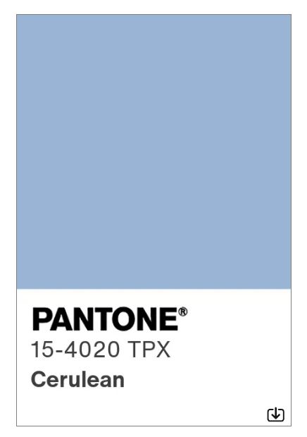
that captured the prevailing mood of the moment. The first color of the year was Cerulean Blue, which was marked as the color of the millennium. The decision wasn’t based on a random choice, but rather on careful analysis of global cultural, social, political, and economic trends, along with input from a team of color experts, designers, and trend forecasters.
Today, Pantone’s Color of the Year is more than just a color – it’s a symbol of trends and sentiments, shaping the visual identity of the year ahead. Whether subtly influencing a fashion collection or inspiring a complete branding overhaul, Pantone’s annual selection serves as a color beacon for industries around the world.
The Relevance of Pantone’s Color of the Year in Marketing and Design
Color plays a critical role in branding and marketing, influencing perception, emotion, and behavior. Pantone’s annual Color of the Year is not just a design trend – it’s a cultural cue. Incorporating this color into your marketing strategy shows that your brand is attuned to the larger social and cultural landscape. It allows businesses to stay current and relevant, particularly in design-driven fields like fashion, beauty, technology, and retail.
In email marketing, where attention spans are short, using a color that reflects a sense of warmth, comfort, and reliability can increase engagement and establish a deeper connection with your audience. Mocha Mousse, with its grounding yet luxurious feel, offers the perfect opportunity to create inviting and aesthetically pleasing campaigns that feel both fresh and timeless.
Why Mocha Mousse Fits the Times
Mocha Mousse is not just a warm, earthy color; it also carries a sense of stability and depth. In a world that often feels fast-paced and unpredictable, this shade represents a need for grounding, comfort, and sophistication. The richness of the color evokes feelings of warmth and reassurance, which aligns with the current cultural climate where people are seeking stability, balance, and a return to simplicity.
Underpinned by our desire for every day pleasures, PANTONE 17-1230 Mocha Mousse expresses a level of thoughtful indulgence. Sophisticated and lush, yet at the same time an unpretentious classic, PANTONE 17-1230 Mocha Mousse extends our perceptions of the browns from being humble and grounded to embrace aspirational and luxe.”
— Laurie Pressman, Vice President of the Pantone Color Institute
In today’s society, we’re seeing a strong shift toward values such as sustainability, mindful living, and emotional well-being. Mocha Mousse perfectly fits this narrative, as brown hues are often associated with natural materials, earthiness, and authenticity. This color speaks to a desire for more authentic, thoughtful connections, making it an ideal choice for brands looking to foster trust and loyalty with their audience.
As we do receive most information through our sight, and colors play a big role in this, let’s look at how shades of mocha mousse could be used in email marketing.
How to Use Mocha Mousse in Email Marketing
Email marketing is an excellent channel for experimenting with color, as it’s a direct and personal way to reach your audience. Here are some ways to incorporate Mocha Mousse into your next email campaign.
1. Email Headers & CTAs
Using Mocha Mousse for your email header or background can create a warm and welcoming atmosphere. Its richness helps create a sense of luxury, which can be perfect for high-end brands or those looking to convey exclusivity. In terms of CTAs, using Mocha Mousse for buttons and links can increase visibility and draw attention in a subtle, elegant way.
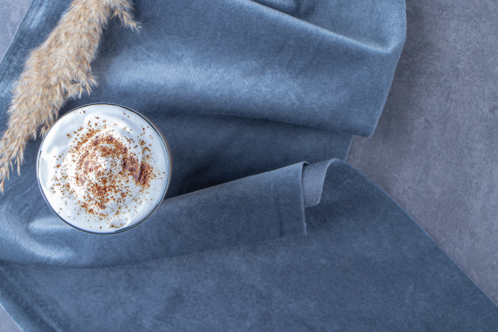
Example: A luxury coffee brand might use Mocha Mousse as the background for an email promoting limited-edition blends, with a prominent CTA button like “Discover Our New Collection” in the color. This aligns perfectly with the warmth of the product and creates a cohesive experience.
2. Subtle Accents & Text Highlights
Incorporating Mocha Mousse into text elements like headlines, subheadings, or key points helps emphasize important information without overwhelming the reader. The rich hue is also ideal for highlighting exclusive offers or product features that deserve special attention.
Example: A skincare brand could use Mocha Mousse to highlight specific ingredients or product benefits, like “Made with Natural Oils,” offering a premium and trustworthy vibe that aligns with the brand’s values of sustainability and quality.
3. Backgrounds & Design Elements
For a more dramatic effect, Mocha Mousse can be used as a background color for entire sections or even the full email body. Paired with lighter colors like cream, beige, or muted gold, it can create a sophisticated, polished look. Keep in mind that a subtle use of this color is key to not overpower the content.
Example: A boutique furniture brand might use Mocha Mousse for an email showcasing new arrivals in their collection. The earthy tone could be paired with product images and text to create a luxurious and inviting design.
4. Textures & Patterns
The richness of Mocha Mousse also makes it a great choice for adding texture or patterns to your emails. This could include things like borders, backgrounds with gradients, or even illustrations. When used creatively, it can add depth and complexity to your design.
Example: A home goods company could use Mocha Mousse in a pattern to highlight their latest cozy home décor line, evoking warmth and comfort that aligns with the season or product collection.
Which Types of Companies and Campaigns Will Benefit Most from Mocha Mousse?
Mocha Mousse’s rich, earthy tone lends itself well to brands and industries that value sophistication, sustainability, and connection. Below are some types of companies and campaigns that would benefit most from incorporating this color:
- Food & Beverage: Mocha Mousse, with its warm and inviting feel, is ideal for brands in the food and beverage industry, particularly those focused on chocolate, coffee, or natural, artisanal products. It enhances the sensory experience of indulgent or comfort food brands.
Example: A chocolate company could use this color in a holiday campaign to promote luxury chocolate boxes, creating a feeling of opulence and indulgence.
- Beauty & Wellness: This color works beautifully in the beauty and wellness industry, conveying a sense of calm, earthiness, and luxury. Brands focused on organic skincare, self-care products, or holistic health services can use Mocha Mousse to evoke warmth and natural beauty.
Example: A natural skincare brand could incorporate Mocha Mousse to showcase a limited-edition facial mask, conveying feelings of rejuvenation and relaxation.
- Fashion & Retail: Mocha Mousse is a versatile color in fashion, especially for autumn and winter collections. It conveys sophistication and can be used for emails featuring seasonal collections, exclusive promotions, or limited-edition items.
Example: A high-end fashion brand might use Mocha Mousse to highlight new arrivals or a special sale, adding an elegant touch to their email design.
- Sustainability & Eco-Friendly Brands: The earthy, grounded feel of Mocha Mousse is ideal for brands that emphasize sustainability, eco-friendliness, or ethical practices. It can help reinforce a brand’s commitment to natural, authentic products.
Example: An eco-conscious clothing brand could use Mocha Mousse in an email campaign promoting a new collection made from sustainable materials, aligning with the color’s natural and organic associations.
What Colors to Pair With
Mocha Mousse pairs beautifully with earthy tones like warm beige, soft taupe, and deep olive green, creating a grounded and sophisticated palette. For a touch of elegance, complement it with accents of gold, ivory, or muted metallics. It also works well with shades of blue like navy, slate blue, or teal, which provide a calming contrast to the warmth of Mocha Mousse. Some shades of turquoise also work well, if you want to add a splash of vibrance to the mix. But to avoid clashing, it’s best to steer clear of overly bright or neon colors like electric blue or fluorescent pink, which can overwhelm the rich, grounding nature of the brown hue and lose its effect and meaning. Combinations with other toned-down colors create a balanced, refined look that highlights the warmth and richness of Mocha Mousse.
Mocha Mousse in Email Marketing: Final Thoughts
Pantone’s Color of the Year for 2025, Mocha Mousse, is an elegant and grounding hue that can be a game-changer in your email marketing campaigns. It evokes feelings of warmth, luxury, and authenticity – perfect for creating deeper connections with your audience. Whether you’re promoting new products, seasonal sales, or brand values through your email marketing, this color provides a rich, inviting backdrop for your message.
Incorporating Mocha Mousse into your email marketing strategy will help your brand stay relevant in the cultural conversation while adding a sophisticated touch to your visuals. Embrace this rich brown tone, and you’ll not only stand out in your audience’s inbox but also communicate a message of authenticity, sustainability, and elegance. Here’s to celebrating meaningful design through connections!