

Subject lines and pre-headers are definitely vital parts of having your marketing emails opened. However, once the reader is “in”, you’re probably expecting them to take some sort of favorable action towards your product or service as well. Thus, today, let’s take a look at calls to action, otherwise known as CTAs. With mobile being an extremely popular environment for opening emails, marketers have to plan not just for desktop clicks but also for mobile taps. Here are some things you should consider when designing your calls to action.
Question Your CTAs
Planning is one of the fundamental steps. As Litmus wrote way back in 2014, one of the first things you need to do is identify the purpose of the call to action. Yes, obviously, the end goal is to drive your email recipients to the intended location via the link, but what’s the recipient-facing aim?
Ask yourself – what does your call-to-action tell the email readers to do? What’s in it for them? Is the CTA clear and not misleading? Put your email-recipient-hat on, and look at your CTAs from their perspective, not just from your business or marketing point of view.
Once you’ve added the CTA(s) to your marketing email, don’t forget about your landing pages as well. If you’ve created a beautiful landing page, make the most of it by adding appropriate CTAs to direct your customers to your product or service. The worst thing you could do is advertise a product your customers really want but forget to add CTAs, making it a struggle for your customers actually to make a purchase.
Types of Calls to Action
There are several types of calls to action:
Text links
A text link is probably the most regular type of CTA. It is a hyperlink in the text of your email. Though in recent years, we have seen a shift from text links to buttons, text links are definitely not extinct. If you’re not sure what works best for your subscribers – buttons, text links, or both – make use of the features of your email marketing platform and do some A/B testing! For example, Smaily lets you send out four different variations of the same email, so you’re guaranteed to figure out the best look and location for your CTA button.
Here’s an example of a text link used in the Sun Savers email:
 Images
Naturally, calls-to-action can come in the form of images, for example, email banners or (nowadays not recommended) image buttons.
You might want to consider designing a banner or another creative image to act as a call-to-action or support your text links or bulletproof buttons. However, don’t forget to add the ALT TEXT to your images!
Here’s an example from Domino’s email – their image creative with a CTA:
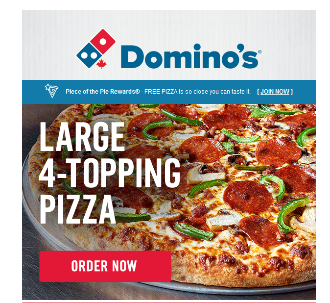
Image buttons were very frequently used in the past (though some companies still have this legacy CTA built in place), but nowadays, they are not recommended. The biggest drawback of these image-based buttons is that they do not always show images. Many reasons for that – for example, the recipients might be in a spot with no internet or out of mobile data, or maybe they have settings to block images by default (common for Outlook users). No images – no image CTA. Therefore, it’s very recommended to use HTML buttons instead of image-based ones.
HTML Buttons
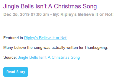
HTML buttons, also known as bulletproof buttons, are built with HTML and CSS. This way, even with images off, your call-to-action will still be visible. Here’s an excellent example from an “offline” view of “Ripley’s Believe It or Not!” email – note how the call-to-action is still visible:
Also, Smaily users don’t need to worry about HTML coding when they think about bulletproof buttons, as our user-friendly drag-and-drop editor will do all the hard work for you. Just select the CTA, customize it, and you’re good to go.
Calls-to-action: Click and Tap
When you’re planning your emails, you have to understand that a big part of your email recipients will open your email on a mobile device. It means that your CTA should be optimized for both point-and-click mouse action and finger-tapping on the small screen.
If you’re using buttons, think about the size of the button. It must be large enough for easy tap and have enough spacing around it. Litmus suggests going with Apple guidelines and starting with at least 44 pixels square.
Don’t forget the positioning of the button. Do you think you should centre-align it? Or maybe move it to the left- or right-hand side of the email?
Remember, when we’re talking about tapping, you need to be aware that some of us are right-handed, and some of us are left-handed. Some of your recipients might be using their left hand to scroll and tap, and some their right. While having your button CTA in the middle is the safest option, we always suggest testing this in your emails and validating what works for you.
CTA Language
For a long time, the most popular CTA was (and for some, it still is!) the cliché “click here”. This phrase is generally considered spammy. Also, it’s quite uninformative and overused. There are so many better alternatives. Depending on the purpose of your CTA, you can use phrases like these:
- Browse here
- Download now
- View more
- Read more
- View here
Your CTA must explain what action will happen once clicked/tapped on it – for example, a download or a view of items for sale. Maybe it’s a link to buy a product right away, or perhaps it’s just an easy way to book an appointment. Be specific but also be creative!
What to keep in mind:
- Use HTML instead of Image buttons whenever possible.
- Smaily users don’t need to worry about HTML coding.
Next: How to Send Engaging Product Update Emails
If you’re sending out an email for each and every update, you could be turning off potential buyers. Next time, we will dig into some great ways you can announce new product features and updates via email that will strengthen brand loyalty and increase engagement.
Make sure you check our blog regularly, and don’t forget to subscribe to our emails. Or you may want to follow up on our last blog post – Learning to Leverage Preheaders and Preview Text – if you’ve missed it.