
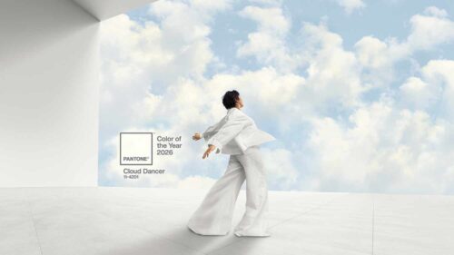
Pantone, known for its influential color system, plays a pivotal role in shaping design trends and visual communication across various industries. Last year, we dove into Mocha Mousse – a warm neutral that quietly reshaped many inboxes. Now we have the opportunity to discuss how to use the color of 2026 – Cloud Dancer in email marketing.
This time, Pantone made a simplistic yet bold statement. And courage these days doesn’t always mean shouting loudly; sometimes it means waving a white flag. Time to put on your design glasses – let’s dive in.
Why Cloud Dancer Fits the Times
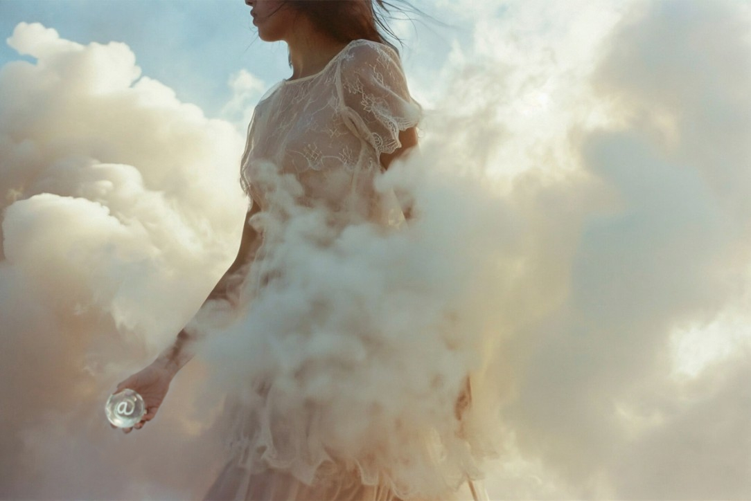
2026 is not exactly business as usual. Between rapid tech shifts and growing fatigue from constant digital noise and heavy subjects, people are craving clarity and space. People aren’t looking for more stimulation – they’re looking for relief. In that context, Cloud Dancer makes perfect sense. This soft, off-white tone with a quiet strength offers visual breathing room and feels so right. We really might be in need of making heavier times lighter.
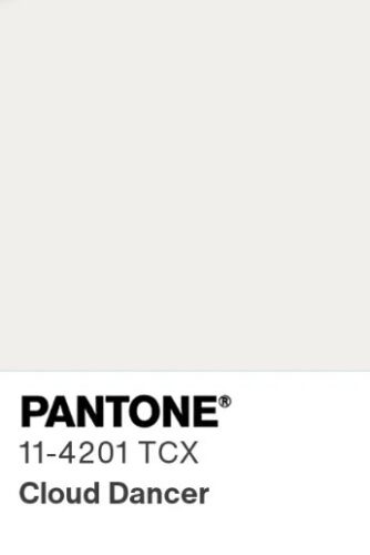
It’s worth noting: this is the first time Pantone has selected a white tone as its Color of the Year since the program began in 1999. And indeed, this choice has sparked some intrigue across the design and business communities, as well as debates as to whether it’s a boring or underwhelming choice. This gentle tone reflects a collective pause – a cultural yearning to reset, reflect, and make room for what matters. It also represents adaptability: in design, in communication, in how we show up as brands.
Similar to a blank canvas, Cloud Dancer signifies our desire for a fresh start. Peeling away layers of outmoded thinking, we open the door to new approaches. An airy white hue, PANTONE 11-4201 Cloud Dancer opens up space for creativity, allowing our imagination to drift so that new insights and bold ideas can emerge and take shape.”
— Laurie Pressman, Vice President of the Pantone Color Institute
Thoughtful changes are beginning to appear. Signals like Pantone’s choice of Cloud Dancer suggest a broader shift toward softness, intention, and human-centered design. In email marketing, this shows up as cleaner layouts, more white space, and calmer color palettes that invite readers to pause rather than scroll past – a reminder that even small design choices can help create clarity in a crowded inbox.
| PS! If you’re curious about Pantone’s heritage and why its Color of the Year matters in marketing and design, you’ll find those details in our 2025 article on Mocha Mousse in email marketing. |
How to Use Cloud Dancer in Email Marketing?
Email marketing is an ideal channel for thoughtful color use, as it creates a direct and personal connection with your audience. Cloud Dancer works especially well in this space, offering visual calm and clarity. Below are several ways to incorporate Cloud Dancer into your next email campaign.
1. Email Headers & CTAs
Using Cloud Dancer for email headers or backgrounds can instantly create a clean, open, and calming first impression. Its soft off-white tone provides visual breathing room, helping content feel more approachable and less overwhelming. When it comes to CTAs, Cloud Dancer works best as a background color paired with contrasting text or subtle outlines, allowing buttons to feel intentional without shouting for attention.
Example: A wellness or lifestyle brand might use Cloud Dancer as the header background for an email promoting a new collection or service, with a CTA like “Explore More” outlined in a muted neutral or soft gray. The result feels inviting, refined, and easy to engage with.
2. Subtle Accents & Text Highlights
Cloud Dancer is ideal for accenting text elements such as section dividers, subheadings, or highlighted statements. Rather than drawing attention through contrast alone, it emphasizes content through restraint, helping key messages stand out naturally. This makes it particularly effective for brands that value clarity, trust, and transparency.
Example: A SaaS or productivity brand could use Cloud Dancer to highlight key benefits or feature callouts, such as “Designed to Simplify Your Workflow,” reinforcing a sense of calm and focus that mirrors the product experience.
3. Backgrounds & Design Elements
For full sections or entire email backgrounds, Cloud Dancer creates a light, modern foundation that allows imagery and typography to shine. Paired with soft grays, warm neutrals, or gentle pastel accents, it helps maintain visual interest while keeping the overall design clean and balanced.
Example: A fashion or home décor brand could use Cloud Dancer as the primary background for an email showcasing new arrivals, letting product photography take center stage while maintaining an airy, elevated aesthetic.
4. Textures & Patterns
While minimal at its core, Cloud Dancer can also support subtle textures or patterns, such as light gradients, fine lines, or soft overlays. These details add depth without compromising the calm, understated feel of the color, making the design more engaging while staying refined.
Example: A modern interiors brand might incorporate a gentle Cloud Dancer gradient or pattern to frame content promoting a new collection, reinforcing a sense of softness, balance, and quiet sophistication.
Which Types of Companies and Campaigns Will Benefit Most from Cloud Dancer?
Cloud Dancer’s soft, off-white tone is especially well-suited to brands and campaigns that prioritize clarity, calm, and human-centered design. Below are some types of companies and campaigns that can benefit most from incorporating Cloud Dancer.
Technology & SaaS
Cloud Dancer works particularly well for tech and SaaS brands that want to reduce friction and communicate ease of use. Its clean, unobtrusive nature supports clear messaging and intuitive design, making complex products feel more approachable.
☁️ Example: A SaaS company could use this tone as the primary background for a product update email, allowing feature highlights and CTAs to stand out without overwhelming the reader.
Wellness & Lifestyle
This off-white naturally aligns with wellness and lifestyle brands, reinforcing balance, mindfulness, and self-care. It supports campaigns that aim to feel restorative rather than demanding.
☁️ Example: A wellness brand might use Cloud Dancer in an email promoting a new meditation program or self-care collection, creating a soothing, uncluttered visual experience.
Fashion & Home
In fashion and home décor, this shade provides a refined, modern backdrop that allows products, textures, and photography to take center stage. It works especially well for minimalist collections, seasonal refreshes, or curated launches.
☁️ Example: A contemporary home brand could feature new linens or furniture against this off-white background, emphasizing craftsmanship and material quality.
Professional Services & B2B
For professional services and B2B brands, Cloud Dancer helps communicate trust, transparency, and confidence. Its restrained elegance creates a polished tone without feeling cold or impersonal.
☁️ Example: A consulting or financial services firm could use this tone in an email campaign introducing a new offering, reinforcing clarity and reliability through a clean, well-structured layout.

What Colors to Pair With?
Cloud Dancer pairs beautifully with soft, muted tones that enhance its airy, calming quality. Shades like light gray, warm beige, and gentle taupe create a serene and balanced palette, perfect for clean, modern designs. For a touch of warmth and sophistication, subtle accents of gold, soft blush, or pale peach can be added without overwhelming the delicate off-white.
It also works well with deeper neutrals like charcoal, slate blue, or muted navy, which provide contrast while maintaining a sense of calm and clarity. For a hint of vibrancy, muted pastels such as sage green or powder blue can add life to the palette while keeping the overall feel understated.

To avoid disrupting its quiet elegance, it’s best to steer clear of overly bright or neon colors like hot pink, electric blue, or vivid lime green, which can clash with the softness of Cloud Dancer and reduce its soothing effect. Pairing it with other toned-down, thoughtful colors creates a refined, airy look that emphasizes clarity, calm, and understated sophistication.
Cloud Dancer in Email Marketing: Final Thoughts
Creating emails that feel calm, clear, and intentional is more important than ever. Cloud Dancer offers a subtle yet powerful way to do just that. By using soft, off-white backgrounds, carefully paired accents, and thoughtful layouts, you can give your subscribers space to focus on what matters most — your message. It’s a gentle reminder that design doesn’t have to shout to be noticed; sometimes restraint communicates more than boldness ever could.
Cloud Dancer reminds us that simplicity isn’t silence. It’s intentional space that lets your message come through.
Sometimes, white really is the boldest color. Let your 2026 emails breathe.