One of the most challenging email marketing aspects is probably dealing with unsubscribes. From a business perspective, it is hard seeing leads or customers opt out. Who wants to watch their email list shrink? But unsubscribes are important. Therefore, today, we’d like to discuss unsubscribes and unsubscribe pages.
Let your email recipients unsubscribe
We won’t talk about the legal requirements of having an unsubscribe link in an email – your email recipients have to have a way to opt out from your marketing emails. However, please don’t hide your unsubscribe link – make it visible. Always remember, it is much better to get an unsubscribe than be marked as spam.
Ways to opt-out
Many companies still use a single-click opt-out. One-click opt-out basically requires just a click on the email link that automatically removes the contact from all future mailings. However, there are better ways to let them unsubscribe than a single-click opt-out – and they can give you much more insight! If you’d like to read more about the positive and negative engagement metrics, take a look at this blog post.
A preference center is usually recommended for companies with many different types of emails. If you cannot build a preference center, it’s always good to at least have a two-step web form. After they click on your email link, they can confirm their opt-out intent on your landing page and then get a web form confirmation. Remember, the pages can be branded and customized! Now let’s take a look at some examples.
Puma
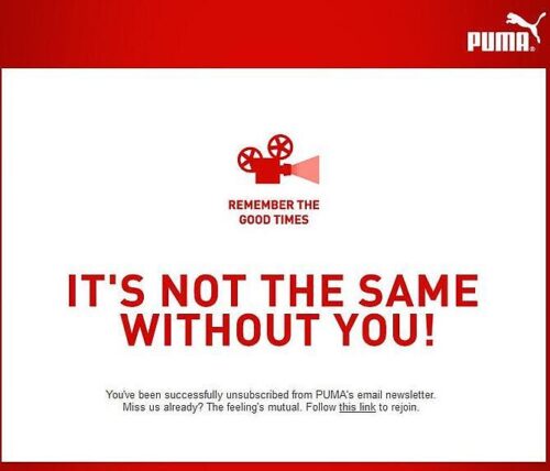
We all change our minds. On your unsubscribe page, give or at least inform about a way how to subscribe again. Take a look at the Puma example – what a clean and nicely branded confirmation. The opt-out language shows that they are sad to see their email recipients go. But the best part here is that there is an option to subscribe again. It’s a great idea to allow their customers to opt into their mailing list if they change their minds.
Wish.com
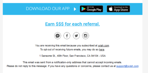
Wish.com emails have a clear and visible unsubscribe link, and they also explain why the recipient received the email.
Their unsubscribe page is actually an uncomplicated preference center – a recipient can easily select which emails or notifications he or she wants to receive and which ones to block. As Wish.com sends emails frequently, they allow their email recipients to limit their emails to a weekly digest communication.
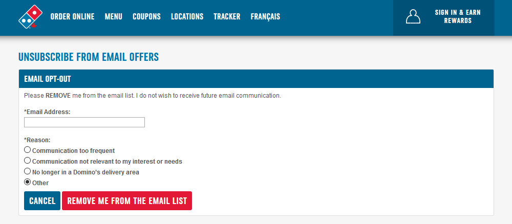
 Domino’s Pizza
Domino’s unsubscribe page is also one of the better examples. It pre-populates the email address field and politely asks for a reason for the opt-out. What a good way to understand why your email recipients unsubscribe! This information can definitely help optimize your send frequency, segment your database better, or work on your content.
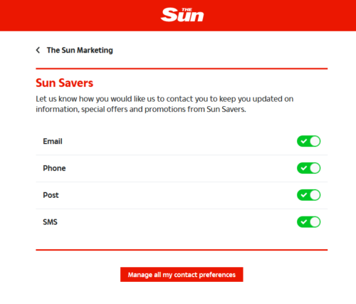
The Sun
If you are engaging in multichannel marketing, take a look at the opt-out page for The Sun. As they engage customers in different channels, they have created a page where customers can change their preferences for each marketing channel. What a convenient way to switch on or off the different types of communications.
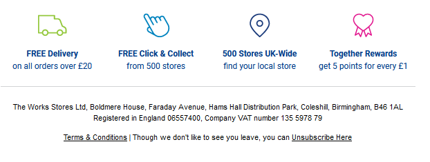
Theworks.co.uk
The Works email footer is nice and clean – even though the unsubscribe is the last thing you’ll see, it’s not hidden. Their email recipients can notice it and click on it if needed.
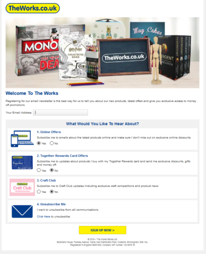
Their unsubscribe landing page is very well planned. It contains a promotional banner with some of its products that the audience can find engaging. There’s a good chance that seeing items from popular brands can make the recipients change their minds about opting out. They also allow managing the subscriptions of their different email types too. This uncomplicated preference center can actually encourage email recipients to try out their different kinds of marketing emails instead of going for a global opt-out.
Test these great ideas
So, what did we learn from all these different opt-out pages? Instead of a single-click opt-out, try out a straightforward two-step landing page, or, if you can, create a preference center where your email recipients can manage their communications.
Make sure you customize your unsubscribe page. Show that you care about your subscribers and that you don’t want them to opt out. Offer them a way to come back – give them an option to re-subscribe to your emails if they change their minds. Maybe, after a while, they’d be interested to hear from you again! Try to give them an opportunity to change the deployment frequency – perhaps too many emails make them want to opt out.
Use the opportunity to learn about your audience – try to have a little survey to find out why your email recipients want to unsubscribe. This knowledge can help you optimize your marketing efforts and to minimize future opt-outs. Why not try to encourage them to stay and not opt out by showing the benefits of being subscribed to your emails?
And lastly, if you’re engaging in multi-channel marketing, it’s very convenient for the customer to manage the preferences of all types of communications in one place – whether it’s SMS, print, or email marketing.
What to keep in mind:
- Better get an additional unsubscriber than be marked as spam.
- Customize your unsubscribe page.
Next: 9 Commandments for Newsletter Creators
Attention equals money – it’s as simple as that. You are worth exactly as much as people are willing to spend their precious time on you. In the next blog post, we will take a look at the nine commandments for gaining and keeping attention when composing newsletters.
Make sure you check our blog regularly, and don’t forget to subscribe to our emails. Or you may want to follow up on the last blog post on Oops Emails: How to Deal with Mistakes in Marketing Emails if you’ve missed it.

 Domino’s Pizza