

Despite many restrictions email marketing has, we all want to make our emails look professional and, of course, engaging. Proper use of visual elements in our emails can help to create beautifully designed templates, enhancing the content and calls-to-action. So, let’s have a closer look at visual elements in email marketing.
CAREFULLY PLAN YOUR EMAIL TEMPLATE LAYOUT
There are various visual elements used in email marketing, including but not limited to personal or product photographs, infographics, or animated gifs. Even the little icons you may use in your email templates are also visual elements. First of all, when planning or designing your images, make sure you keep in mind your audience, the purpose of your email, and, importantly, your template layout.
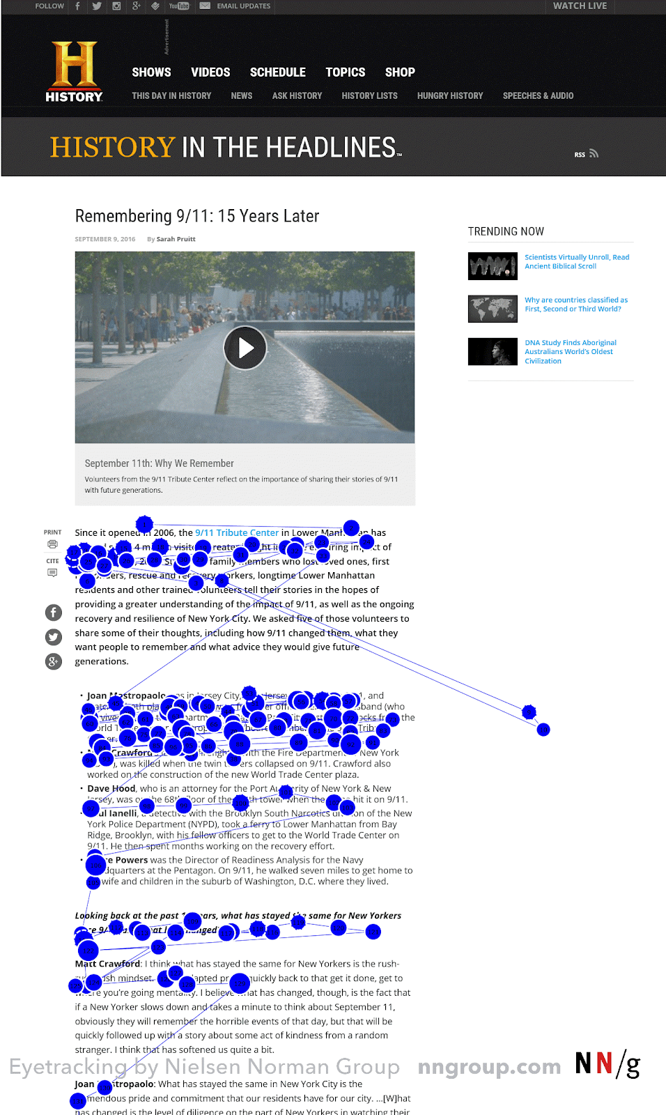
According to the Nielsen Norman Group study, readers skim through the content in an F-shaped pattern. So, what does it mean? It means that your email has certain hot spots that your subscribers will notice, but some parts of your email may go unseen.
Thus, when planning your image sizes and positions in the template, consider the F shape reading pattern. Don’t forget to A/B test your images and layouts. Moreover, segment your mailing lists. While mobile phone email openers will most likely see your engaging images, Outlook users may have images switched off by default.
Remember, visual elements need to help your email fulfill its purpose – to help sell your products or services, increase brand recognition, strengthen trust, or build client relationships.
YOUR LOGO REPRESENTS YOUR BUSINESS
Logos are one of the most significant visual elements that you should have in your email templates. Your logo represents you, your business, your products and services. Logos should be seamlessly integrated into the templates. They should be visible, but they shouldn’t distract the reader either. Let’s have a look at some example emails where the logos do not take away attention from the CTAs, but nicely blend into the template.
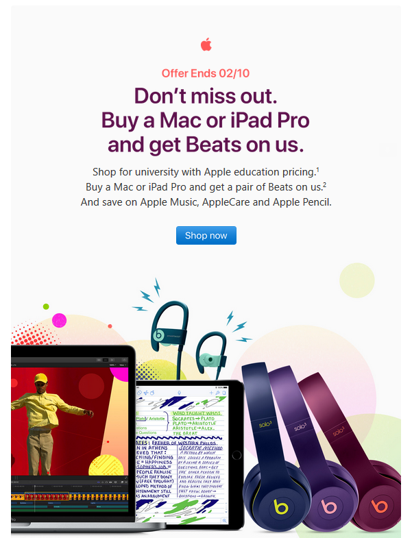
In this Apple promotional email, subscribers will probably notice a familiar logo first thing when they open it. Moreover, it’s the logo they trust, so they are encouraged to continue reading. At the same time, the logo is not too big and does not take away attention from what Apple is trying to say (or sell).
In our second example, ASDA has done an excellent job displaying its logo right below the pre-header. When the email is opened, you can see that it’s an ASDA newsletter right away, and if you’re their client, you would know what to expect in this email. You start creating associations with the phrase “ASDA newsletter” – and that helps the company build trust with its readers. We also need to notice that brand colors work wonders in this template – the logo colors nicely match their bright call-to-action buttons.

ICONS MATTER TOO
Though they might not be the visual element that your clients will first notice, they are there for a reason.
Icons can help strengthen your brand design and help your email look and feel match your websites and other promotions. They can help your readers quickly scan through the content too. Nowadays, in most cases, icons will be used to represent social media channels or different ways to contact the sender.
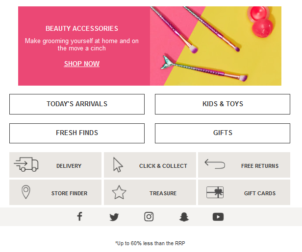
For example, email from TK Maxx uses icons not only for social media channels but for their business services too – to represent delivery, returns, store locator, gift cards, and more.
PRODUCT AND SERVICE IMAGES: SHOWCASE WHAT YOU SELL
If you’re sending a sales email for a specific product, try showcasing the product up close or in action. If it’s clothing, it’s a good idea to include a photo of your target audience wearing it. Thus, if you can segment your database to match the images, you’d get even better results. For instance, if you’re trying to send a promotion to a particular age group, try to include photos that this specific age group can relate to. The same strategy could be used for targeting other segments, such as gender, locations and more. Let’s have a look at some examples.
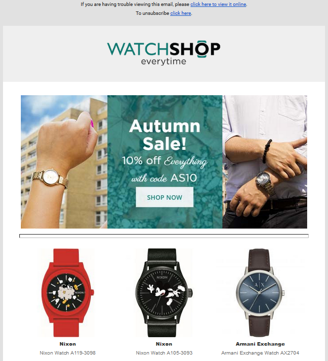
We can see that Clarks did an excellent job showcasing baby shoes – the image there not only shows the shoes up close, but we can also see what they look like when a cute little toddler is wearing them. The Watchshop email also follows a similar visual element strategy – they have different genders wearing different types of watches, trying to build interest in multiple audience segments in one email.

ANIMATED GIFS: A BIT OVERLOOKED, BUT SURELY EFFECTIVE
Many retail brands have discovered the value of animated gifs in emails – they make your message lively and entertaining, strengthen your calls-to-action, and increase engagement. Animated gifs can be one of the most fun visual elements in emails.
However, when there’s a positive, there’s a negative – animated gifs are not supported everywhere. So when you’re designing an email with an animated gif, make sure you have a fallback plan or thoroughly segment your database to ensure the visibility of your gifs for maximum results. See the Litmus guide for email client support for animated gifs.
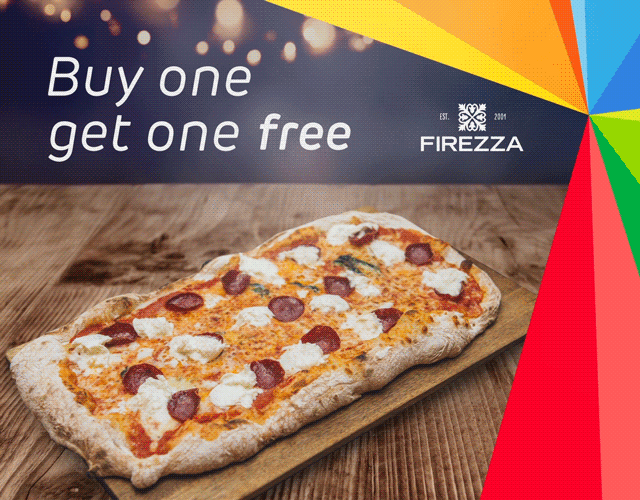
Now, let’s see some cool examples of emails utilizing animated gifs. This Just Eat email will definitely boost the appetites of their subscribers – with a lively image of a steaming hot pizza.
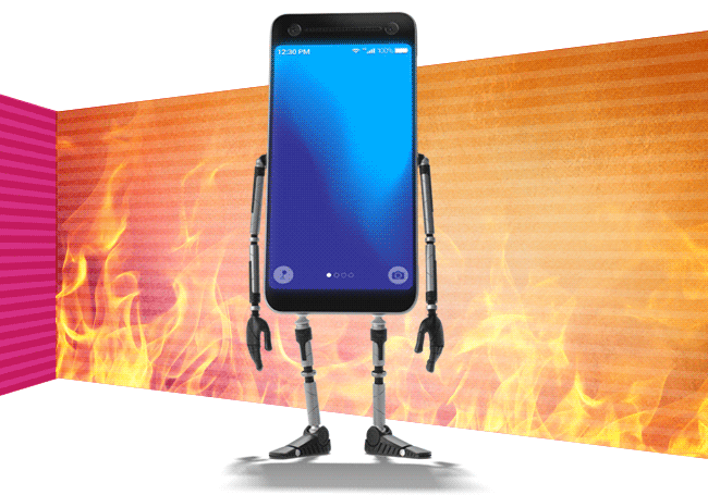
Carphone Warehouse will pique readers’ interest with this animated GIF – a new phone, excited for new deals. This is a good way to grab attention and encourage us to read on!
A few tips: when creating animated gifs, make sure the image size is not too big. They need to be small in size but still be of good quality! The first frame matters the most – it’s a good fallback option for your readers who won’t be able to see the animation.
So next time you’re planning your email template, remember that images not only liven up your email templates but they impact your brand recognition, nurture relationships and trust between you and your subscribers, and help to illustrate your point and call to action.
What to keep in mind:
- Readers skim through the content in an F-shaped pattern.
- Icons can help strengthen your brand design.
Next: Understanding Email Marketing Environment: Email Client Share
Undoubtedly, most of us have noticed that email marketing is becoming more and more focused on the experience on mobile devices. No surprise there, as we all expect great rendering and fantastic content on the go, right there on our small screens. Hence, in our next blog post, we will take a look at email opens with a focus on the email client share: what has been happening and what we can expect in the future.
Make sure you check our blog regularly and don’t forget to subscribe to our emails. Or you may want to follow up on the last blog post on How to send better emails if you’ve missed it.