Are you curious about the dark mode in email marketing? Is it just a fad or a lifestyle choice?
Imagine your eyes straining from the bright light on the screen as you wind down for the evening. This is where dark mode comes into the picture. Dark mode in emails is nothing but a calming black background with light text, replacing the conventional bright background. This mode provides comfort in low-light conditions, making it easier on the eyes.


Dark mode is not just a niche feature. Many email clients now offer this option, making it accessible to a wide range of users. This modern feature allows readers to apply a dark color theme to their emails, reducing glare and making it easier to view screens while working at night or in dimly lit areas. It’s a testament to the growing recognition of the need for user-friendly digital interfaces.
This article will explore the benefits of using dark mode and why it might be the email setting you’ve been missing for so long. Let’s get started!
Why You Should Use Dark Mode In Your Emails?
Since dark mode has become a valuable feature rather than just a trendy aesthetic option, there is a growing emphasis on making emails dark mode-ready. According to a study by Android Authority, approximately 82% of people currently use the dark mode feature on their devices and apps.
Dark mode offers many advantages in terms of user experience, accessibility, and device efficiency. Let’s explore the special benefits it provides:
Reduced Blue Light and Eye Strain
One of the key benefits of dark mode is its ability to lessen eye strain. Extended use of bright screens can cause discomfort and possibly harm your eyes over time.
Dark mode helps solve this problem by employing darker backgrounds, which lessen glare and blue light exposure. This makes it easier for users to read emails, especially during the night.
Longer Battery Life For OLED Displays
Devices with OLED screens can benefit from increased battery life when using dark mode. Dark mode saves energy by turning off pixels to display black. LCD panels, on the other hand, consume the same amount of energy regardless of the color displayed.
As a result, using OLED devices in dark mode can significantly save power and let users use their devices for longer periods of time without needing to recharge.
Enhanced Visual Impairment Accessibility
People with conditions like cataracts, myopia, ADHD, and Photophobia often find it challenging to see text on bright screens. Dark mode can make it easier for these individuals by providing a more comfortable viewing experience. Also, ensuring your emails work properly in both light and dark settings can help you reach a wider audience.
Improved Low-Light Reading Experience
Dark mode provides a better reading experience in a poorly lit room. It is especially helpful for those who prefer not to expose their eyes to strong light immediately before bed. Dark mode’s reduced glare and softer contrast can make reading emails more pleasant in various lighting situations.
Visual Appeal and Modern Look
Not only is dark mode practical, but it also has striking visual appeal. This can be crucial for companies that want to project a modern image for their brand.
The subtle contrasts and darker color themes that dark mode possesses can give users a sophisticated and immersive email experience. Additionally, dark mode offers customization options, enabling users to improve their experience further by customizing their email viewing.

What Impact Does Dark Mode Have on Email Deliverability?
Before discussing the impact of dark mode on email deliverability, let’s define deliverability. It is the ability of your email campaigns to reach your receivers’ inboxes without being mistakenly marked as spam. The average deliverability rate for emails is approximately 85.7%, indicating that 14.3% of emails fail to reach their intended recipients.
Although dark mode has numerous advantages, if it is not correctly optimized, it can also pose challenges for email deliverability. Let’s explore how using dark mode may impact email deliverability.
1. Issues With Dark Mode Compatibility
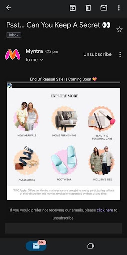
Compatibility problems often arise with dark mode. Many email clients may not always automatically optimize images, logos, and other visual components, making emails appear cluttered.
This can also lead recipients to mark these emails as spam or disregard them entirely. As a result, your sender’s reputation and general deliverability suffer, too.
2. Sender Reputation and Subscriber Engagement
Maintaining an active subscriber count is essential for keeping a positive sender reputation. A malfunctioning email layout can cause recipients to mark emails as spam, unsubscribe and eventually ignore them. These actions can lead to your emails being completely blocked.
Therefore, ensure that your emails display properly in dark mode to enhance the user experience, which will ultimately have a positive impact on your email deliverability.
3. Design Challenges in Dark Mode
Creating emails that work specifically in dark mode has its own set of challenges. In dark mode, the colors of the screen are inverted. For example, black writing on a white background, which is usual in conventional mode, becomes white text on a black background.
Similar to the text, images, and graphics, particularly with white backgrounds, may appear differently as a result of this inversion, creating contrast issues.
Additionally, some color combinations also don’t work well in dark mode, making the text unreadable to the user. Hence, it’s crucial to test your email designs on a variety of email clients and devices to prevent these problems and ensure that emails look good in both settings.
4. Email Client Variations
The way different email clients handle dark mode can significantly impact how your email design appears. While some email programs fully or partially invert colors, others make no adjustments to the design. Here is a brief list of different email clients and how they handle dark mode:
- Hey.com, Apple Mail, and iPad Mail: No changes to the design
- Outlook.com, Outlook (Mac OS), Outlook (iOS and Android), and Gmail (Android): Partial color inversion
- Windows Outlook: Complete color inversion
Customizing your email themes for the most popular apps by considering how different clients handle dark mode improves readability and engagement.
Additionally, ensuring accessibility is crucial. Using tools like online text to speech can help you verify that your emails are accessible to all users, including those who rely on screen readers. This approach not only enhances the user experience but also broadens the reach of your communications.
How To Optimize Your Emails For Dark Mode?
It is crucial to ensure your emails are optimized for the dark mode. Properly optimizing your emails will improve deliverability, engagement, and readability. Here are some guidelines to help you prepare your emails for dark mode:
1. Use PNGs That Are Transparent
To ensure your images look great in both light and dark settings, use transparent PNGs. These images have no background, preventing abrupt contrasts when the background color changes.
Here’s how to do it:
- Select images with a white or colored background.
- Save the images as transparent PNG files.
- Test your logo and other key visuals to verify they appear well on both light and black backgrounds.
2. Give Dark Fonts And Images A White Outline
Dark-mode backdrops can cause dark text and graphics to disappear. Adding a white outline to them improves reading and visibility. This method works especially well for images with a lot of text and logos.
3. Take Into Account Plain-Text Emails
Plain-text emails are dark mode-compatible by default. They ensure readability by being authentic and simple, and they adjust to dark mode settings with ease.
The three major benefits of incorporating plain text emails are:
- They have no intricate design features.
- They automatically adapt from light to dark mode.
- Their simpler designs lead to improved deliverability.
4. Modify Email Design Elements For Dark Mode
Some email design components might need to be adjusted to function properly in both light and dark settings. This includes icons, colors and CTA buttons. When using dark mode, try sticking to muted colors that are gentle on the eyes.
Here are some tips you can consider:
- Avoid colors that are too saturated.
- Ensure the contrast of other graphics, such as social media icons, is adequate.
- Test color combinations in both light and dark modes.
5. Examine Your Dark Mode Email Correspondence
Testing is essential to ensure your emails display properly on various clients and devices. Before sending an email, preview it using tools like Litmus or BEE Editor. If external tools aren’t available, try manually sending the email to yourself and testing it in various email programs and modes.
Here is a checklist for testing:
- Check the transparency of images.
- Verify the readability of texts and links.
- Ensure icons and logos appear properly.
- Verify that the font and background colors are suitable.
Coding Tips For Dark Mode Emails
With the right coding techniques, you can give your email subscribers a flawless dark-mode experience. The following crucial coding advice will help you make your emails dark mode-ready:
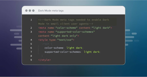
1. Use Meta Tags To Enable Dark Mode and: Root Selector
First, use meta tags to inform email clients that your email supports light and dark modes. This ensures that your email displays properly in dark mode.
Meta Tags: Include the following meta tags in your email’s HTML <head> section.
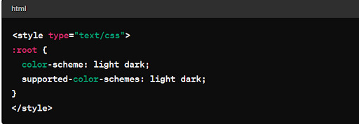
root Selector: To specify the allowed color schemes, use the: root selector in your CSS
With this configuration, the email client can identify and use the proper color scheme without filtering through every style.
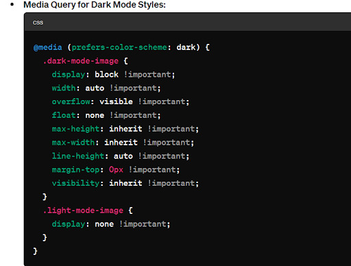
2. Use Media Query To Include Dark Mode Styles
Use CSS media queries to adjust how your email looks in dark mode. This lets you choose distinct styles for elements like links, backgrounds, fonts, and logos.
Media Query: Insert the following media query into the email <style> block.
This method allows you to customize the color values that work best for your brand in dark mode.
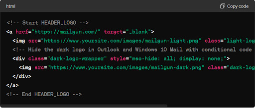
3. Add Appropriate Elements And Style To Dark Mode Elements
Make sure that elements are styled and displayed appropriately for both light and dark modes. This is especially crucial for graphics and logos with variations for every mode.
By adding the necessary classes and styles, you can ensure that your email elements display correctly in both bright and dark modes.
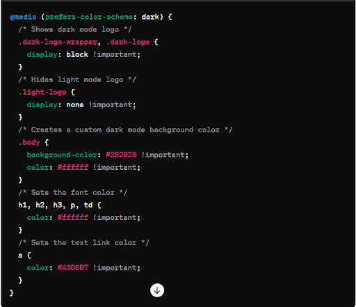
4. Include @media Dark Mode Styles (prefers-colour-scheme: dark)
To customize dark mode themes for different email clients, such as Apple Mail, iOS, Outlook.com, and Outlook App (iOS), insert this media query in the <style> tags.
This query would ensure that your dark-mode emails look good across various email clients.
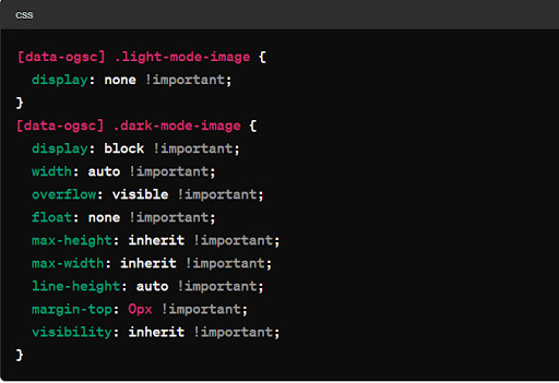
5. Include the Prefix [data-ogsc] to Avoid Dark Mode Style Duplication
Add the [data-ogsc] prefix to your email styles to ensure compatibility with Android’s Outlook app’s dark mode.
This prefix guarantees that the Outlook app on Android devices applies your dark mode styles accurately.
Integrating these coding techniques ensures a seamless dark-mode experience for your email subscribers while maintaining the visual integrity of your brand. For expert assistance, professionals in web design can help you create visually appealing and functional emails that cater to dark-mode users.
Dark Mode in Email Marketing: Wrapping Up!
Dark mode is more than just a trend; it offers significant benefits like reduced eye strain, longer battery life, and improved readability in low light. By optimizing your emails for dark mode, you enhance deliverability, engagement, and user experience.
Following the coding tips and best practices outlined in this article will help you create emails that look great and function well in both light and dark modes.
About the Author

