Did you know that email marketing is one of the best channels for generating ROI?
According to a survey conducted by WBR Digital, 81% of marketers said email marketing prompts customer acquisition and retention. And now that 85% of promotional emails are reaching customer inbox, it’s becoming increasingly important for businesses to create an email campaign that is not only relevant to their subscribers but can also entice them to convert and buy. This year, you want to integrate a landing page into your email campaign to capture more leads and make it easier for your subscribers to take action! A landing page is a standalone web page where visitors land after clicking on your ad. It is created specifically for a marketing or advertising campaign that is meant to lead prospects to a specific product, service or offer, and inspire them to take action. Ideally, a good landing page will drive traffic to your site, improve your SEO, and direct leads to conversion. However, not all landing pages are created equal. You must optimize your landing pages to get the best results. In this article, we will teach you how to create the best email marketing landing page that generates great results for your campaign.
Tips for Creating the Perfect Email Marketing Landing Page
Here are the tips to help build your perfect landing page.
1. Simplify Your Landing Page
According to Salesforce, when a health and fitness website simplified its landing page, its conversion rate increased by 20%.
This means getting rid of any unnecessary design elements that only clutter your page can help improve your landing page’s effectiveness. A clean and simple page design makes it easier for visitors to read the call to action on it, which you want them to focus on.
Also, when a graphic design online course provider shortened their landing page, it helped increase their click-through rate by 25% and their signups by 13%. It means that eliminating any information, links, pictures, and other visual clutter can also optimize your landing page.
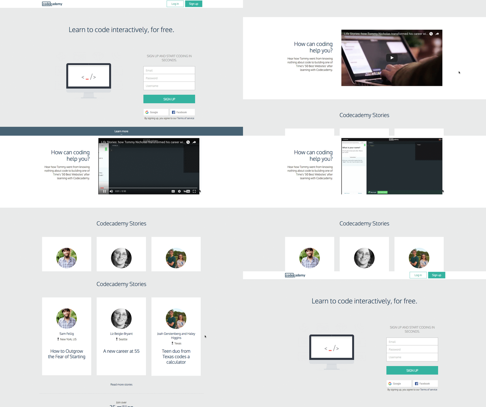
Codecademy demonstrates a great example of a simple landing page that communicates volumes without many words.
What we love about this landing page is that the call-to-action is the main focus. It gives a clear message of the offer and what you’re going to do to access that offer. It simply prompts you to sign up so you can start learning how to code for free!
Incorporating a simple email marketing landing page into your campaign makes it easy for your subscribers to see what they need to see without getting distracted.
It helps increase their likelihood to take action and convert. It’s also important that you choose a good email template that’s mobile-friendly and effective. Smaily allows you to create eye-catching email templates that fit any device.
Now that you know that decluttering is the key to a more optimized landing page, you might wonder what elements are essential to leave.
To help you, here are the 5 essential elements every effective landing pages have in common:
1. Scroll-stopping headline
Your headline should be interesting enough to grab your visitor’s attention but also simple enough to understand right away what your product or service is all about.
It’s best to keep your headline short and memorable. A good example is InVision’s headline “ Design Better. Faster. Together”.
It’s short, gets to the point quickly, and catches your attention.
2. Compelling subheads
The goal of your subheadline is to persuade visitors to take action.
To do this, you can briefly talk about how they can benefit from your product or service, or something unique about your company. Shopify’s subheadline is a great example of a compelling subhead.
They use the phrase “Trusted by over 400,000 businesses worldwide” to convince business owners to sign up. It tells you that they’re established, credible, and reliable in what they do.
3. Engaging Visual Content
Visuals play an important role in your landing pages.
They help communicate to your audience and support the text on your page. Make sure to use stunning visuals that are engaging and relevant to your products or services.
According to Eye View Digital, using videos on landing pages can help boost conversion rates by 86%. In 2021, use video for your landing page!
4. Methods of Contact
You want to tell people you’re legit by placing all your methods of contact in place, from your physical address to your email address and phone number up to the contact form.
You might also want to add live chats in a popup feature. It’s not exactly necessary, but it can help eliminate any resistance in the conversion funnel by providing your visitors a personalized email marketing landing page experience.
Live chats can respond to queries quickly, clarify any confusion or doubt of the visitors, and boosts trust. The goal is to make it easier for visitors to reach you. The simpler the process is, the higher the chance that they’ll take action.
5. Assurance or Guarantee
Giving your visitors assurance or guarantee is a great way to make them feel certain and confident while on your landing page.
It also helps boost conversions. You can communicate guarantee to your visitors in so many ways, but you want to choose a type that’s suitable for your business.
Different types of guarantee:
- Lifetime Guarantee – It tells visitors how easy it is to return a product, the kind of customer service they can expect, and how much confidence you have in your products. This type of guarantee creates trust in your quality products
- Free Trial Guarantee –People love free stuff! It’s also a great way to get a customer hooked on your products or services. If a customer feels satisfied using your products or services during the free trial period, chances are, they’ll be willing to pay full price once it’s over
- Lowest Price Guarantee – Using this type of guarantee can help your online store stand out from your competition. It also gives visitors a strong reason to buy from you
- Happiness Guarantee – This type of guarantee might sound odd but it works! You can take a more sentimental position by telling your visitors how important their happiness is to you.
If you’re offering a moneyback guarantee or a lifetime warranty on your site, try building it around positive feelings and use power words.
- Brand Promise Guarantee – This type of guarantee sets you apart from your competitors and keeps your business delivering the high-quality service that your customers need. It’s also a great way of adding a little twist to your guarantee and making it your very own.
An example of this would be the mattress company, Casper. Instead of saying 100-day-warranty, they use the company phrase 100-nights trial period.
- Powerful Call to Action- A powerful call to action is important to guarantee conversions. Stay away from the basic “submit” button. Somehow, people no longer feel compelled by it. So, instead, be creative in your CTAs by using persuasive, fun, or exciting words. Landing pages with personalized calls to action perform 202% better than regular CTAs (Hubspot, 2020).
Use Psychology of Colors
Choose the right colors on your landing page to influence the mood of your visitors, prompt physiological reactions, and communicate certain qualities. You should also use contrast to highlight a certain area you don’t want visitors to miss, especially your CTA.
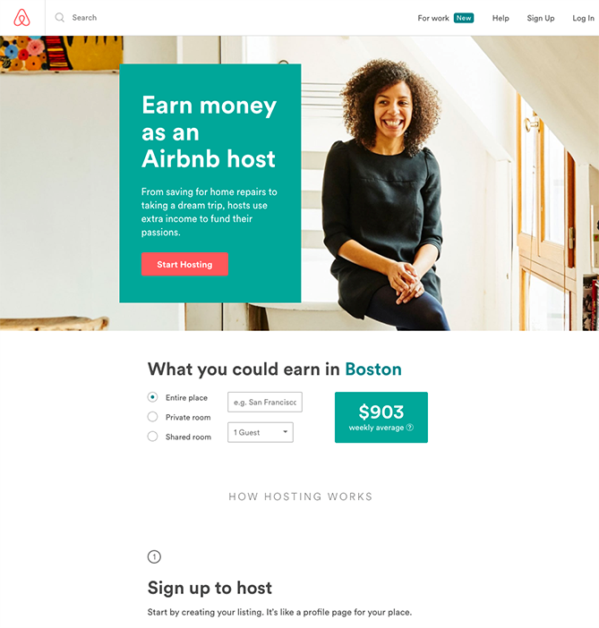
Here’s a good example from Airbnb of using contrasting colors in a simple yet effective way:

Choose a Branded Design
While using the psychology of colors is important, it’s also crucial that your landing page design is brand-friendly and beautiful.
You want to remain consistent on all your social presence, from your Facebook Ads to your website up to your landing pages. Over time, visitors will develop a sense of familiarity with the color, text, and kind of imagery your brand uses, and associate all these elements with you.
Smaily makes it easy for you to create a stunning and successful landing page with minimal effort!
Feature Social Proof
To further convince people to take action, you also want to feature social proof on your landing page. Show them the number of likes, shares, subscribers, etc. your business has.
You can also feature recommendations, reviews, and ratings. 71% of millennials are more likely to purchase a product that has good reviews or is recommended online (Hubspot, 2019).
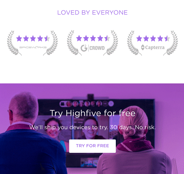
So, you want to place them in a prominent area on your landing page as well. Here’s a good example by Highfive:

This landing page features reviews from other sites above the fold. It’s a great way to establish that your brand is trusted and loved by everyone!
Optimize Your Landing Page
Optimizing your landing page for SEO is important because it helps search engine bots understand what your landing page is about and rank it high for relevant searches.
Here are tips on how to make your landing page SEO-friendly:
- Publish to a custom URL
- Strategically add your keywords throughout your landing page
- Attach backlinks to your page
- Make sure your landing page loads within three seconds or faster
- Treat your subheading as your meta description
- Optimize the pictures or videos on your landing page
Are You Ready to Incorporate the Perfect Landing Page into Your Email Campaign?
An effective landing page can boost the effectiveness of your email marketing campaign. It will not only drive users to your site but it catches lead and inspires them to convert and buy from you!
Use these tips to create a better landing page designed to make your email marketing campaigns more effective.
Author bio: Rumzz Bajwa is a digital strategist and content marketer for Digital Resource. She enjoys spending time with her family. She loves to go out and experience new moments whenever they came to light. Rumzz finds satisfaction in investigating new subjects that help to extend her points of view. You can frequently locate her immersed in a good book or out searching for a new experience. Connect with her on Twitter.


