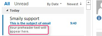
When you’re planning your next email campaign, don’t forget to think about your preheaders and preview text. Their value is becoming increasingly acknowledged. Moreover, voice assistants now have the functionality to read emails (that includes a preheader, too!) – therefore, it is a great time to learn to leverage preheaders and preview text!
Preview Text and Preheader Explained
Preview text and preheaders are sometimes used to refer to the same idea, but they are, in fact, slightly different concepts. Preview text is the actual text that you see after/under the subject line in the inbox. Preheader text refers to what’s added to the email code to control the preview text.
In the email template, the preheader can appear in the email body above the header. However, you don’t need to have it visible in the email design if you don’t want to. Thus, whether the preheader text is displayed or is hidden in the email template, the preview text would still show.
Useful Tips for Optimization
Now that we know what the difference between a preview text and a preheader is, let’s see what you can do to improve your emails with them. While sometimes automatically generated preview text might work, you can go a step further – test and optimize them and create more interest and, in turn, generate those desired email opens.
Subject line support
On a mobile device, the subject line and preview text is one of the main factors encouraging readers to open your emails. Preview text should work well with your email subject line. Many call that space a “second subject line opportunity”. Make sure they are supporting each other and are not disconnected.
However, please don’t repeat the subject line in your preheader; it would waste valuable preview text space. The example below illustrates how the preview text opportunity could have been used for something much more engaging than “View this email with images”.
Personalization
If you have a clean and reliable database, you can add personalization to show up in the preview text. However, use personalization with caution. For example, a personalized salutation in the subject line and your preheader might be a bit too much.
Emojis
Remember, standing out in the inbox gives your email a better chance to be opened – why not try out adding some emoji to be displayed in the preview text in the mailbox? However, again, don’t overdo it, especially if you’re using emojis in your subject line. Test, test, test, and optimize each time! Here’s a beautiful example of emoji displayed in the preview text.
Support or show the call-to-action
Preview text is excellent for supporting your email call-to-action or even acting as a secondary CTA. It’s good real estate, so make sure you use that space wisely! You don’t have to have a direct CTA such as “shop now”. You can try different ways to support CTAs, such as asking a question, for instance, “How to get more Instagram followers?”. You can also create urgency by showing a deadline in the preview text.
Preview Text: Length
The subject line rule of thumb is to be short and catchy. It is similar to the preheader text. The usual range of displayed preview text characters is between 40-140 characters. Naturally, a desktop would show more text, while mobiles would display less.
Therefore, the beginning of your preview text is the most important. Litmus has created a handy table showing which clients support preview text as well as the average number of characters being displayed there.
Be Creative and Always Improve
You should try and apply this knowledge to every send, and every time review and compare the results – there’s always something new to learn. We understand the importance of preheaders and preview text; thus, we made it super easy to add preheaders to your emails while you are creating your email marketing templates. Just click on the preheader button and add the text you wish to be shown.
What to keep in Mind:
Keep on testing – that’s how you will get the best insight about your subscribers and how to get them more engaged!
Next: Call-to-action: What You Need to Know about CTAs
Next time, we’ll take a look at calls-to-action, otherwise known as CTAs. Marketers have to plan not just for desktop clicks, but also for mobile taps. In the next post, we’ll share some things you should consider when designing your calls to action.
Make sure you check our blog regularly, and don’t forget to subscribe to our emails. Or you may want to follow up on the last blog post on the Top 3 Email Subjects Tips for 2020 if you’ve missed it.

