

Do you read your emails more on your mobile or computer? As early as 2015, TechCrunch claimed that 75% of Gmail users read their mail on mobile. It is claimed that 58% of adults read their emails as one of the first things in the morning, doing so mostly on mobile. You can find out what is happening in the Estonian market in this post!
Opening emails from mobile is on the rise
Before we can dig into the statistical numbers, let’s think about how users interact with their mailbox. Emails sent to B2B customers are mainly opened on computers during business hours. Also, during private hours, the private mailbox is often viewed on a computer. At the same time, all the time that people spend on driving a bus or waiting in a queue or are on hold in some other activities, they tend to send emails on their phones. That includes reading mail on their phones.
Smaily looked at statistics on opens and clicking on emails within the last two years in three categories: commerce, services, and leisure. The figure below shows the % of opens and clicks by categories on desktop and on mobile.
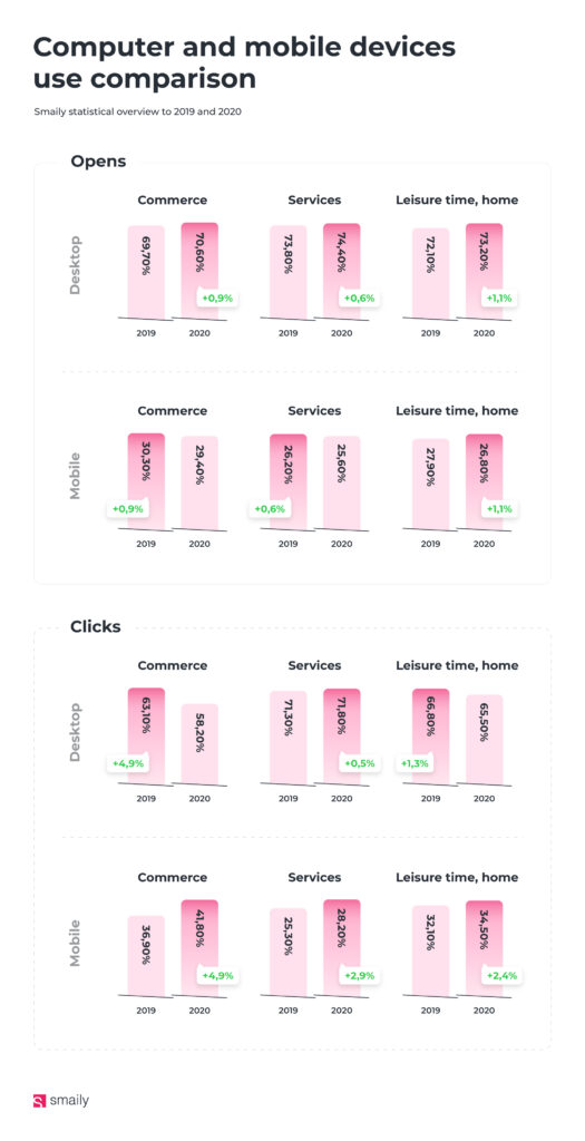
Broadly speaking, ¾ openings are made on the desktop and ¼ on the mobile. Specifically, the share of all openings was 69.7% – 74.4% for desktop and 25.6% -30.3% for mobile. The proportion of letters opened on a desktop has increased slightly compared to two years ago. Emails are most often opened in the area of computer services.
In the case of clicks, the share of mobile devices is slightly higher – 25.3% – 41.8% of clicks are made there. The desktop generates 58.2% -71.8% of clicks. The share of mobile clicks has been rising over the years. It is also seen that those who open a message on their mobile are more likely to click on it.
How to see who is opening your messages in Smaily
For each campaign you send, you can see statistics on how many messages were opened on your mobile phone and how many on your desktop. To do so, visit the “Demographics” page in your campaign statistics view, where you can see which programs are used to open messages on both computer and mobile. When looking at statistics, keep in mind that Gmail, Apple Mail, and other programs are used on both mobile and PC and therefore include openers on all devices. Only mobile specific programs are shown under “Mobile device.”
How to make a mobile-friendly letter?
The term mobile first has been used in website development for many years. This means that web developers first build a page that is as good as possible to view on a mobile phone, and only then start building a page that fits on a computer screen. The screen of a mobile phone is just so much smaller, it holds significantly less information at a time. Also the webpage on a mobile phone is used in a completely different way than on a computer, for example, by swiping your finger across the screen. All clickable parts must be large enough to still be able to hit the button when tapping with the finger on the screen. So in terms of all the design and user-friendliness, optimizing a website for a mobile phone is quite different from a computer screen.
However, it is not yet popular that when composing the design of an email, you should first think about what it looks like on a mobile phone. Usually all the designing is still done on a large computer screen, where everything is clearly visible, not on mobiles.
What to think about when putting together a template:
– Drag and drop templates automatically change the view according to the device – for example, if you have an image and text side by side, then one of them moves down in the mobile view. Therefore, try to avoid the words “see the image next to it” in the text.
– Pictures occupy a large part of the phone screen. They undoubtedly provide a lot of visual information and are attractive, but always check to see if the CTA button is visible and close enough to the image and text.
– The text size should be at least 14, smaller text is difficult to read on a mobile phone.
– Make the buttons large enough to hit it with your finger
As always, test the message to make sure the mobile view is correct. Litmus, Testi.at are just two examples of software that shows what the font looks like on different mobiles, as well as in browser windows and email software.
PS! If you want to read more about how e-mail programming works, read the article “Email Coding vs Web Coding: It’s Not The Same”.