
A strong email list is one of the most effective ways to grow your sales funnel and create strong customer relationships. With a good email list, after all, you get to reach the right customers with the right messages. However, building and growing an email list is not an easy task. This is why you need to know the best popup practices for email marketing.
Email popups don’t just help you collect web visitors’ email addresses. Research shows that email popups are a great email marketing conversion strategy, too. They convert 3.8% of website visitors on average, which equals around 400 emails out of every 10,000 visitors. Are you looking to enhance your email marketing strategy with email popups? Here are six email popup best practices you should follow today.
1. Make the Popup Timely and Relevant
When designing an email popup to help you grow and build an effective email list, you must ensure that it is timely and relevant to your web visitors. You can’t display your email popup immediately after a first-time visitor gets on your site. Nor can you display random popups without understanding how the visitor interacts with your site’s content.
The best way to ensure you create both timely and relevant popups is by using triggers and personalization, respectively.
Triggers, in particular, will tell you when exactly to display your popup for high conversion chances. Let’s check out some of the action and time triggers you must consider when showing your popups.
Time spent on site
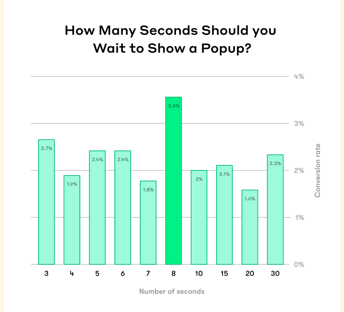
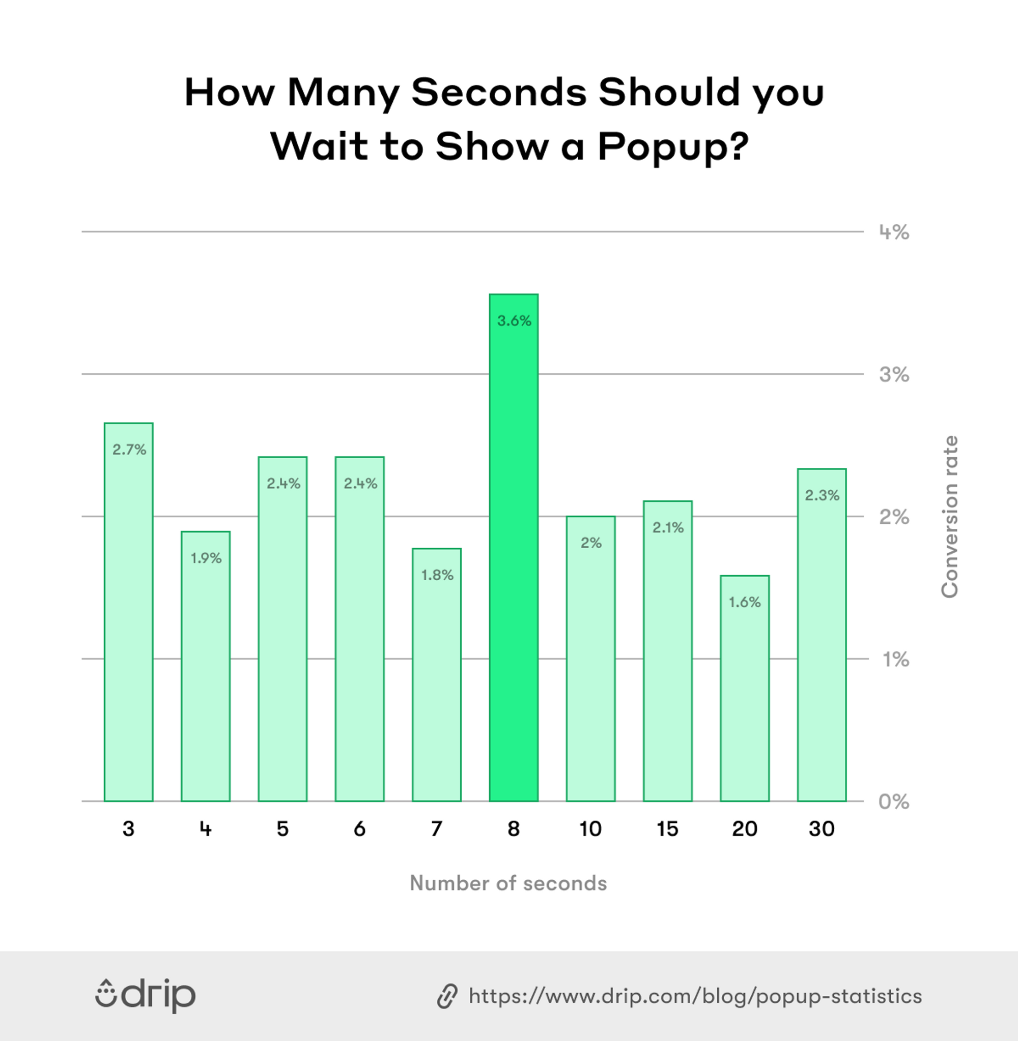
You want to give your visitors enough time to engage and grow invested in the content on the page. Research states that popups displayed at the eighth second convert better than those shown before or after.
But I don’t think that’s really a hard and fast rule. I personally think the time your popup appears should depend on your site’s own data. Start by determining how long your visitors often spend on a page. You can discover this from the Average Session Duration metric on Google Analytics. Then set your popup to show around 50% of the average time visitors spend on your page. For example: if visitors stay on a page for an average of 2 minutes, set the popup to appear when the visitor has been there for one minute.
Number of pages viewed
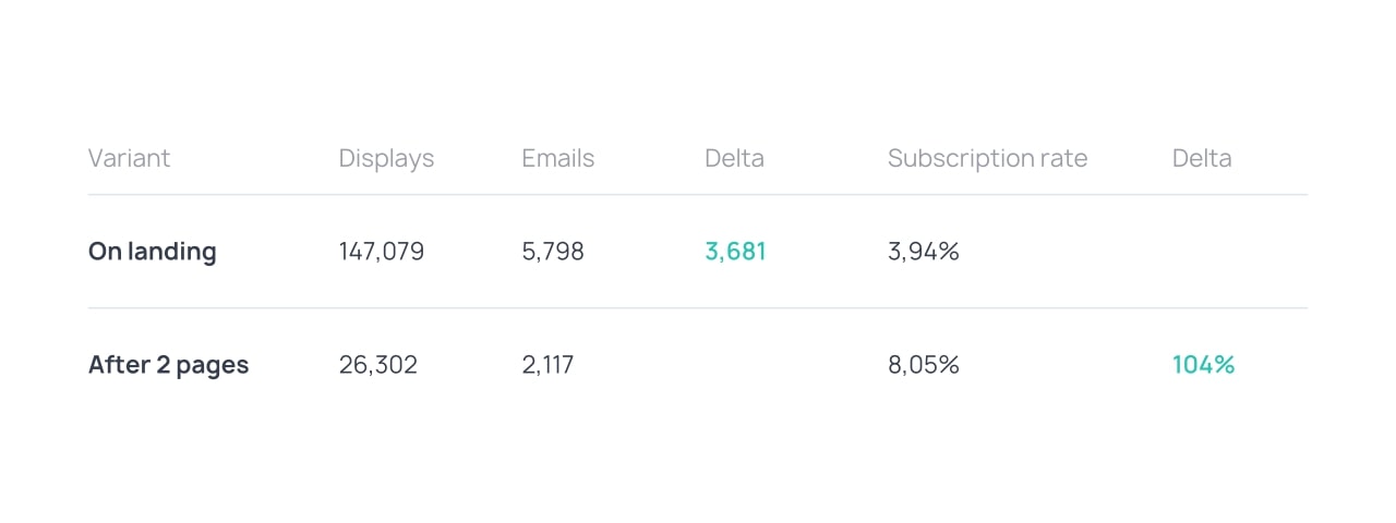
It’s important to wait until the second or third-page view before displaying your popup because it is only at this point the visitor is already invested in the pages or content they are reading. The image below illustrates this further.
The screenshot shows that the subscription rate more than doubles when a popup is displayed after two pages compared to when it is immediately shown on a landing page.
Exit intent
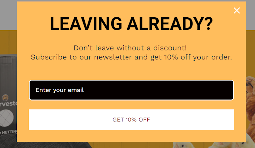
The popup can be triggered when a visitor takes an action that proves they’re about to navigate away from your site or a specific page. The action could be moving the mouse pointer to the address bar or a long period of inactivity on the page.
The exit popup that appears as a response should offer value to the visitor. So, it could offer a discount code or gift, as shown below.
While triggers show you when to display the popup, personalization will help you settle on the right popup content for different categories of visitors. But first, you need to understand your visitors by segmenting them into categories based on the content they engage with, where they come from, and whether they’re first-time or returning visitors.
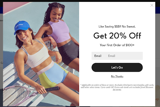
For instance, here’s a great email popup example for first-time visitors.
One important thing is ensuring the same popup doesn’t reoccur for repeat website visitors. When this happens, it’s very annoying and will definitely make the visitor experience negative in the long (or not so long) run.
Don’t just rely on popups for your email list-building, though.
There’s always a chance your website visitors gave you a wrong email address. So, you still need to verify these before you include them in your email list. Many email tools that help marketers find target email addresses also have a verification feature you can use for this.
2. Keep It Simple
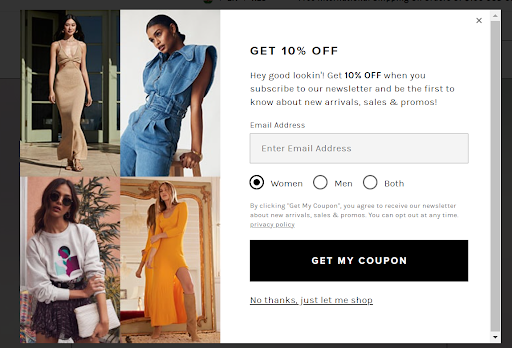
The strength of your email popup is in keeping it simple, from the headline to the input fields. So, don’t include too much in your headline and supporting copy. The text volume in the example below can be taken as a suggested maximum, and exceeding this should be avoided if possible:
Though email popups offer a great opportunity to collect your site visitors’ data, asking for too much will reduce your odds of getting the email field filled. So, ensure you only have one or two input fields. You can just ask for a first name and an email address, as shown in the example above.
Then just get the extra information once you have their email address. By doing this, however, you must also ensure that you comply with the rules stipulated by GDPR and other privacy rules.
Whether you get the information later depends on how good the email will be. So, a good email should always be part of your eCommerce, B2B, or SaaS email marketing strategies.
Make sure the email is well written from the subject to the sign-off. In case you need a little help or inspiration with this, you can use various digital tools to write a great email. For instance, use an email subject line generator to create a great subject line that gets their attention.
3. Add Images and Graphics
It’s easier to get people’s attention with visuals because they evoke emotions. This is why adding relevant images is one of the email popup best practices you shouldn’t disregard.
However, you can’t just add images and graphics that crowd your popup. Make sure your email popup has a balanced image-to-text ratio, where there is neither too much text nor images that confuse readers.
Also, use images and graphics that are in appealing and calming colors that attract site visitors. Make sure, though, that when people look at your popup, your images and graphics won’t overshadow your CTA.
You must also ensure your visuals are on-brand to avoid confusing web visitors. If they can associate your popup with your trusted brand, they’re more likely to trust you with their email addresses, too. So, use high-quality images and graphics so your viewers will associate with you. Maintain your brand’s color scheme throughout your popup, too.
4. Use a Strong Call to Action
A call to action (CTA) can be the final push visitors need to part with their email addresses. So, make sure you use strong CTAs. Avoid the same old “subscribe” CTA and think outside the box.
You also need to use a clear action verb that’s relevant to what’s being offered in exchange for your visitor’s email address. Examples of these CTAs include “collect my discount” or “send me updates.” Such clear actions should help visitors understand the value they stand to gain if they subscribe to your email list.
You can emphasize this value in the text accompanying the CTA, too. The image below is a perfect example of this:
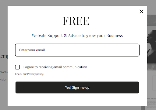
See the “Website Support & Advice to grow your Business” text above the CTA. That’s the value the business promises to provide the visitor if they subscribe.
Also, stick to one CTA because too many might end up confusing your web visitors. Pay attention to its font, text color, and the button’s background. It’s always a great idea to make the CTA text bold and use a contrasting background for the CTA action to pop out. Your CTA button color should also contrast with the popup and page background’s color.
5. Ensure Popup Is Mobile-Friendly
Statistics show email popups generate 74.27% more conversions on phones than on computers. So, one of the most important email popup best practices is ensuring your popups are mobile-friendly.
Design a responsive popup form. Remember, the mobile view has limited touch control, screen space, and bandwidth. A responsive popup will help you avoid drastic layout shifts when it loads on different devices and browsers.
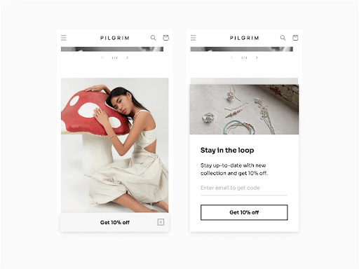
Simplify your mobile popup design, too. Check out this great example:
Use smaller sticky bars and slide-in popups instead of full-screen popups that are hard to navigate for mobile users. Also, limit the number of input fields, reduce the font size, and ensure that your email popup copy is clear and brief.
6. Test and Optimize
You won’t get the best email popup the first time around. What you can do is test your popups to determine what works and what doesn’t. Then you can optimize them based on what you found.
A/B tests investigate various elements of your email popups to find out what works best for your audience. You can A/B test:
- Different email popup types. Experiment with slides, sidebars, floating bars, and bottom bars to see which ones are the best for your business.
- Popup design and interface. This can vary from copy to images used, text color, font, CTA text, button colors, and the number of input fields.
- Popup timing. Find the best times to display your popup to different segments of your audience. How many seconds should a visitor spend on your page before your popup comes out?
That number of seconds may vary, depending on the type of audience. For instance, a person who deliberately searched for your website may want to see the popup much later than the person who just happened to click on a social media link that led to your site.
- Incentives offered in the popup. While free shipping might work well in one campaign, a discount might work best in another. Keep testing until you find the special offers that work best for different campaigns.
Remember that certain popup elements might work well today but not as well the next time. So, you must keep experimenting and reevaluating to ensure your popup remains effective.
In Closing
These popup practices for email marketing can help you make the most out of your email campaigns. They help you build and grow an effective email list. However, it’s not enough for you to just design a popup and incorporate it into your site. There are email popup best practices you must follow to ensure the form is effective. We have discussed six of these.
Start by making timely and relevant popups, keep popups simple, and use a strong CTA. Also, ensure the popup is mobile-friendly, add images and graphics, and test and optimize your popup elements.
Follow these email popup best practices, and you’ll grow a high-quality subscriber list that boosts your conversion rates. All the best!
About the Author
Owen Baker is a content marketer for Voila Norbert, an online email verification tool. He has spent most of the last decade working online for a range of marketing companies. When he’s not busy writing, you can find him in the kitchen mastering new dishes.