



A strong email campaign can do almost everything right: precise segmentation, a compelling subject line, thoughtful copy, a well-timed send, and a CTA that generates plenty of clicks. And then the landing page quietly undoes all of it.
This is one of the more frustrating failure modes in email marketing because the campaign metrics can look healthy right up until the moment the subscriber arrives on-site. Open rates are solid. Click-through rates are strong. Traffic is qualified. Yet conversions lag.
The problem often isn’t the email; it’s the handoff.
An email and its landing page are effectively two halves of the same conversion experience. The email creates intent; the landing page has to preserve and capitalize on it. Any mismatch between the two can create problems, and even small issues can be costly.
Here are five landing-page mistakes that routinely make good email campaigns underperform.
Why Your Landing Page Matters
A great email can get people to click, but what happens next is just as important. Your landing page is where that interest needs to turn into action—whether that’s making a purchase, signing up, downloading something, or filling out a form.
And there’s plenty of room for that conversion to be lost. The median landing-page conversion rate across industries is around 6.6%, which means most visitors still don’t convert. Of course, that number doesn’t tell the whole story. What counts as a good conversion rate depends heavily on the industry, the offer, the audience, and what you’re asking visitors to do. A B2B demo request, for example, will naturally behave differently from a simple newsletter signup.
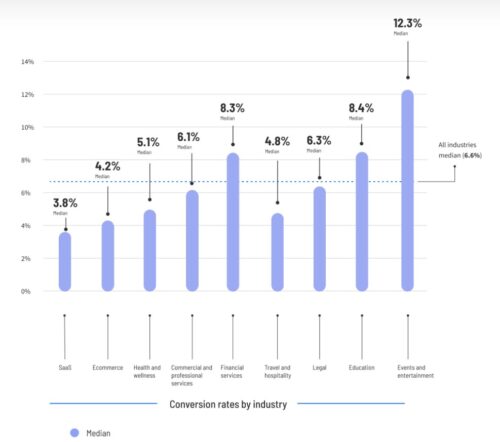
That’s why your landing page deserves the same attention as the email that sends people there. If your campaign is generating clicks but those clicks aren’t turning into results, the problem may not be your email at all – it may be what happens after the click.
1. The Landing Page Doesn’t Deliver on the Email’s Promise
The first few seconds after the click matter enormously.
A subscriber has just responded to a specific proposition in your email. Maybe it was a limited-time offer, a product benefit, marketing for your webinar, a new report, or a personalized recommendation.
They click, expecting to see more of exactly that. Instead, they land on a generic homepage, a broad product page, or a landing page with a headline that barely resembles the message that persuaded them to click. And that’s a continuity problem.
Think of the email’s CTA as making a micro-promise: Click here, and you’ll get this. The landing page needs to immediately confirm that the promise was kept.
If the email says “Get 30% off your first order”, and the landing page opens with “Discover our collection”, you’ve created unnecessary cognitive work. The visitor has to figure out whether the offer still applies, where to find it, and what they’re supposed to do next.
| Instead, the landing page should reinforce the original proposition:
30% Off Your First Order |
This isn’t merely a copywriting preference. Message continuity reduces the mental gap between I want this and I know what to do next.
What to check
Compare your email and landing page side by side.
Look specifically at:
- Headline and offer language
- Product or service being promoted
- Promotional terms
- Imagery and visual cues
- CTA language
- Urgency or deadline
- Audience-specific messaging
The closer the experience feels to a single continuous conversation, the less likely people are to lose interest.
2. You’re Sending High-Intent Traffic to a Page Built for Everyone
The email gives you an unusual advantage: you often know something about the person before they click.
You may know their industry, where they are in the buying journey, what they’ve bought before, what products they’re interested in, or what caught their attention in your email.
Yet many marketers send these highly interested visitors to the same generic page they use for everyone else. That could be their homepage or a general product page. It’s a missed opportunity.
Someone who clicks an email about enterprise analytics, for example, may already understand what the product does. They may be looking for pricing, customer examples, or details about how the product works.
Someone visiting your website for the first time may need much more basic information before they’re ready to take the next step.
That doesn’t mean creating a completely new landing page for every email. It could mean using dynamic content, creating a few versions for different audiences, or simply adapting a few key elements of the page to match the email.
The key question is: “Who is this visitor, and what do they need from this page?”
Use what you already know about the audience to make the landing page more relevant to them, instead of creating one generic experience for everyone.
| 🎓 Want to take personalization further?
Learn how browsing behavior can help you tailor content and create more relevant experiences in “Behavior-Based Email Marketing: How Browsing History Drives Personalization.” |
3. The Page Introduces More Choices Than the Email Did
Email marketers spend considerable effort reducing friction in the inbox: one primary CTA, concise copy, clear hierarchy.
Then the landing page arrives and opens the floodgates. Navigation. Product categories. Blog links. Social feeds. Multiple competing CTAs. Pop-ups. Chat widgets. Related resources. “Learn more” links. A newsletter signup.

Suddenly the subscriber has twenty possible next actions instead of one.
Not every landing page needs to be stripped to the bare minimum. But the page should have a clear hierarchy of intent.
If the email’s purpose is to get webinar registrations, the landing page’s primary job is to make registration feel like the obvious next step. Everything else should support that decision, or get out of the way.
A useful test is to look at the page and ask: “Can a visitor identify the primary action within three seconds?”
If the answer is no, the page may be asking the subscriber to make too many decisions. This becomes particularly important for mobile traffic, where competing elements consume proportionally more attention and screen space.
4. The Form Asks for Information the Conversion Doesn’t Require
There’s a familiar tension in lead generation: sales wants more data, marketing wants more segmentation, and the landing page gets stuck carrying the burden.
So a simple content download turns into a form asking for:
- Full name
- Work email
- Company
- Job title
- Company size
- Industry
- Country
- Phone number
- Marketing preferences
Every additional field creates another opportunity for abandonment.
That doesn’t mean shorter forms always produce better business outcomes. If you need certain information to qualify leads, asking for a few extra details may be worthwhile – even if it means a bit less people completing the form.
The mistake is treating every field as equally valuable. For each field, ask “What decision will we make differently because we collected this information?”
If the answer is “none,” just remove it. Especially if you can get the information in another way later, then there’s no need to ask for it now.
The goal isn’t to get as many people as possible to complete the form. It’s to get the right people to complete it and ultimately become valuable leads or customers.
After all, a 40% completion rate on a useful qualification form may be more commercially valuable than a 60% completion rate on a form that generates poorly qualified leads.
5. You’re Measuring the Email and Landing Page as Separate Systems
This is perhaps the biggest analytical mistake.
Email performance is frequently evaluated through metrics such as opens, clicks, click-to-open rate, and unsubscribe rate. Landing pages are evaluated through sessions, bounce rate, form completion, and conversion rate.
Those metrics are useful, but the real question is what happens across the entire journey.
Consider Two Campaigns
Campaign A
- 35% open rate
- 6% click-through rate
- 12% landing-page conversion rate
Campaign B
- 28% open rate
- 4% click-through rate
- 28% landing-page conversion rate
Campaign A looks better if you stop at the email. Campaign B may produce a comparable – or even better – business outcome once post-click conversion is included.
That’s why email optimization should extend beyond the click.
Look at the Funnel as a Connected System
| Delivered → Opened → Clicked → Landed → Engaged → Converted → Revenue |
Then diagnose where the largest meaningful drop occurs.
A campaign with excellent click-through rates but weak landing-page conversion doesn’t necessarily need a better email. It may need a better post-click experience.
And the reverse is true too: a highly optimized landing page can’t compensate indefinitely for weak targeting or an unconvincing email.

The Bigger Lesson: Optimize the Handoff, Not Just the Channel
Email and landing pages are often owned by different teams, measured in different dashboards, and optimized against different KPIs.
Your subscriber doesn’t care. To them, the email and the landing page are one experience.
That’s why some of the biggest gains in email performance don’t come from another subject-line test or another 5% improvement in click-through rate. They come from fixing what happens after the click.
When reviewing your next campaign, don’t stop at “Did people click?” Ask: “Did the landing page continue the argument the email started?”
If the answer is no, that’s where your next conversion-rate improvement may be hiding.