

If you thought we were going to start this article without saying, “A picture is worth 1000 words”, you were mistaken. Clichés stand the test of time for a good reason. The truth is that marketing is highly visually oriented. After three days, people tend to remember 65% of what they saw, compared to 10% of what they remember hearing. You can tell your subscribers a long story about your product, but in the end, they will still only believe what they see. Of course, visuals of all kinds are vital in email marketing, and a good product image or image that speaks to the subscriber’s senses can work wonders. What’s the role of different images in email marketing, and which style should you use in your emails? As you’ve opened this article like an album, scroll on to discover the options that suit you.
Imagery in Email Marketing
Visuals prove to be the most valuable form of information, as according to MIT, it takes only 13 milliseconds for the human brain to process an image. Thus, it’s unsurprising that about 90% of the information transmitted to our brain is visual.
Imagery plays a pivotal role in marketing, acting as a visual gateway to capture attention and convey emotions more swiftly than words alone can achieve. Within the realm of email marketing, photos serve to enrich content, break the monotony of text, and offer readers a quicker grasp of the message’s essence. Moreover, images should not be merely decorative; they can be powerful tools for product advertisement or calls to action (CTAs). An aptly chosen photo, coupled with a compelling CTA, can drive engagement and conversions, making the visual component an indispensable ally in email marketing strategies.
Different Types of Images
There are a considerable number of types of visuals that can be included in a marketing email. These different images also serve various purposes, and their choice depends on the purpose of your email. Let’s review the most notable types of images that you can use to decorate your email and promote your product or brand.
The Product Photo – No Marketing Without it
Product photography is an essential aspect of marketing, and it plays a crucial role in email marketing campaigns. The product photo shapes the customer’s first impression of a product and can make or break a sale. Therefore, creating high-quality product photos that showcase the items in the best possible light is essential.
When using product photos in email marketing campaigns, it is also necessary to consider the message being conveyed. The photo should align with the email’s overall message, whether it is promoting a sale, highlighting a new product, or providing information about your company’s goods or services.
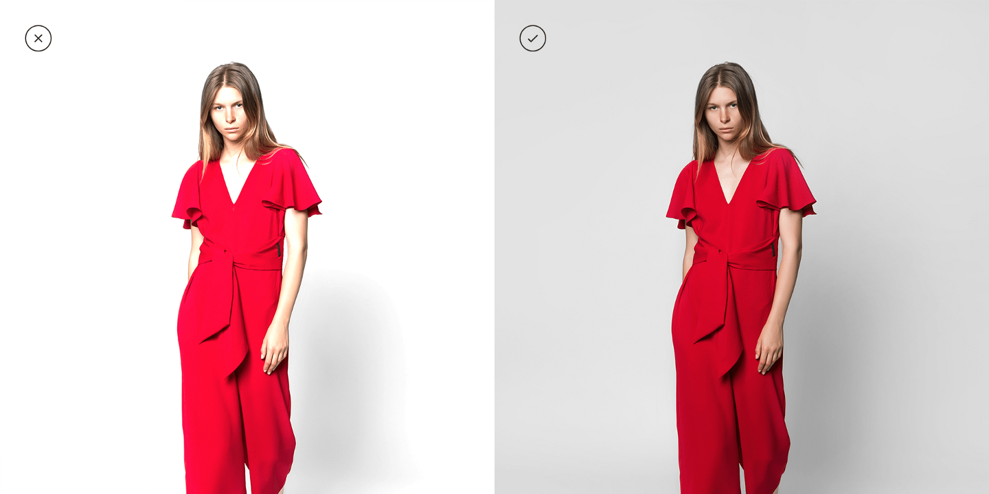
A catalog photo refers to a type of image specially designed to be displayed in a product range, whether in a company’s online store or in a printed catalog. These photos are usually simple, high-quality images that show the product clearly and accurately, giving customers a complete overview of the item. The main focus is on the product, presenting it on a clean, usually neutral, and monochromatic (often white) background to focus on the product and its details.
Using a floating product image is a new, quite captivating marketing trend. This is a photo that appears to make the product float in mid-air, achieved by removing the background and adding a drop shadow or reflection. This type of photo provides a modern and consistent look, which helps the viewer focus. However, remember that using this image may not be suitable for all products. For instance, some products, like outdoor equipment, may need a background to provide context about their utility. A tent, for example, might look more appealing when set up in a natural setting rather than floating. Larger items, like cars or home appliances, could look awkward or lose their sense of magnitude in a floating image. Their appeal often comes from being showcased in a real-world environment.
A packshot, distinct from regular product photos, captures not just the product but also its packaging (often a key buying factor), showcasing both design and enhancing brand recognition. Utilizing packshots in marketing emails is particularly effective for new product launches or branding campaigns, as they highlight the packaging’s appeal alongside the product, creating a comprehensive and enticing visual experience.
In any case, the most important aspect is to ensure that the product photo accurately represents the product and follows best practices for product photography.
Several rules should be followed to create high-quality product photos:
- Lighting. Lighting is key. Natural light or a softbox can showcase the product in the best possible light – literally. You can also play with the direction of light by adding sparkle and shine to the product, thus emphasizing the beauty of the packaging and the exclusivity of the product.
- Background. A clean background, without distractions or clutter, is also essential. Carefully consider which color/surface you choose for it and whether it fits the product and your brand.
- Correctness and visibility. It’s also fundamental to ensure that the product is in sharp focus and that the photo accurately represents its color and texture. For the sake of honesty, avoid excessive image processing, such as adding too much saturation or changing the product’s shape, material, or other characteristics.
- Placement. The product should be the focal point of the photo, and it should be showcased in a way that highlights its best features.
- Size and format. The size and format of the photo should be optimized for the platform where it will be used. For example, images that are too large cannot be used in marketing emails.
Picture Perfect – Showcasing the Allure of Product Benefits
Images highlighting the benefits of what’s being offered are particularly powerful. These photos are also called lifestyle product photographs, as they often place the product within real-life scenarios to emphasize its value and appeal.
Firstly, there’s the practical image. It zeroes in on the tangible features, vividly illustrating the product in action. Take, for instance, an advertisement for a waterproof watch. The image might show a diver exploring underwater marvels, with the timepiece prominently displayed on their wrist, ticking uninterrupted by the surrounding water. Here, the photo doesn’t just display the watch; it demonstrates its resilience and reliability in the exact environment it’s designed for. It’s an implicit promise of performance that a simple textual description can’t match.
On the other hand, we have the emotional image, aiming not just at the intellect but tugging at the heartstrings. This type of image captures the feeling or emotion associated with the product’s benefits. Consider a travel agency promoting a tropical vacation. The chosen image might depict a serene sunset on a secluded beach, with a couple enjoying a peaceful moment. The promise here is not just of a destination but of an experience – tranquility, romance, and rejuvenation.

The reason these images work wonders in marketing is twofold. First, they make the abstract concrete. Instead of telling prospects about advantages, you’re showing them firsthand. It simplifies comprehension and fast-tracks the decision-making process. Second, they cater to our human inclination towards stories. People don’t just buy products; they buy narratives, aspirations, and feelings. An image that encapsulates these elements enhances the appeal of the product or service while also resonating deeper with the prospective customer, building a connection that mere words might struggle to forge.
People Behind the Product, Service, and Brand
Talking about images exhibiting emotion, one effective strategy is showcasing the real faces behind your offers. These can be, for example, dedicated tailors crafting the garments in the fitting room, your team of friendly and helpful customer service staff, or the farmers behind growing the produce used in your product. You can even highlight your team in the newsletter. For example, a software company can introduce its developer team, showcasing the people who write the code and ensure smooth user experiences. With a caption like “Meet the Wizards Behind Your Favorite App!“, it gives subscribers a look behind the curtain.
Humans are naturally inclined towards social interactions and connections. When subscribers see the people behind the brand, it establishes trust, adds authenticity, and makes the brand more relatable. It’s a subtle reminder that behind every product or service, there’s a team of individuals working passionately. Incorporating photos of your dedicated workforce marketing emails not only adds a dash of authenticity but also stands as a testament to the brand’s commitment to transparency and connection.

From Fans to Brand Ambassadors: The Power of User-Generated Photos
There’s no endorsement quite as authentic as one coming directly from satisfied customers or brand ambassadors. In email marketing, integrating photos taken by these individuals can add an unparalleled layer of authenticity and relatability. After all, user-generated content (UGC) means that people create it without receiving payment, and their motivation comes purely from their brand loyalty and the brand’s effective marketing. (On a side note, a paid or mutually beneficial UGC-related content type is cooperation with bloggers and influencers). User-generated content, candid and genuine, resonates with subscribers because it showcases real-life use or admiration of a product or service.
Take, for instance, a travel company featuring holiday snaps from a family who recently booked one of their packages. Or perhaps a skincare brand showcasing the glowing selfie of a customer who swears by their moisturizer (before and after pictures are a good idea here). These are not just photos; they are stories of trust, satisfaction, and brand affinity. It crafts a narrative beyond conventional advertising, leaning into organic and authentic advocacy. Using these photos signals to potential customers that your brand is loved, trusted, and valued in the real world. Just be sure to always ask for permission from the author and people displayed in the image.

User-generated content can be used in very masterful ways. A brilliant example of using UGC in marketing was Apple’s Shot On iPhone campaign launched in March 2015. The company encouraged people to share remarkable photos taken with their iPhones and add the campaign’s hashtag (#ShotoniPhone) to their posts. This initiative was an enormous success and had a two-fold impact: It showcased the quality of the product and strengthened the brand image by bringing people together to create and enjoy content collaboratively.
Personal, Authentic, and Unedited = Simply Believable
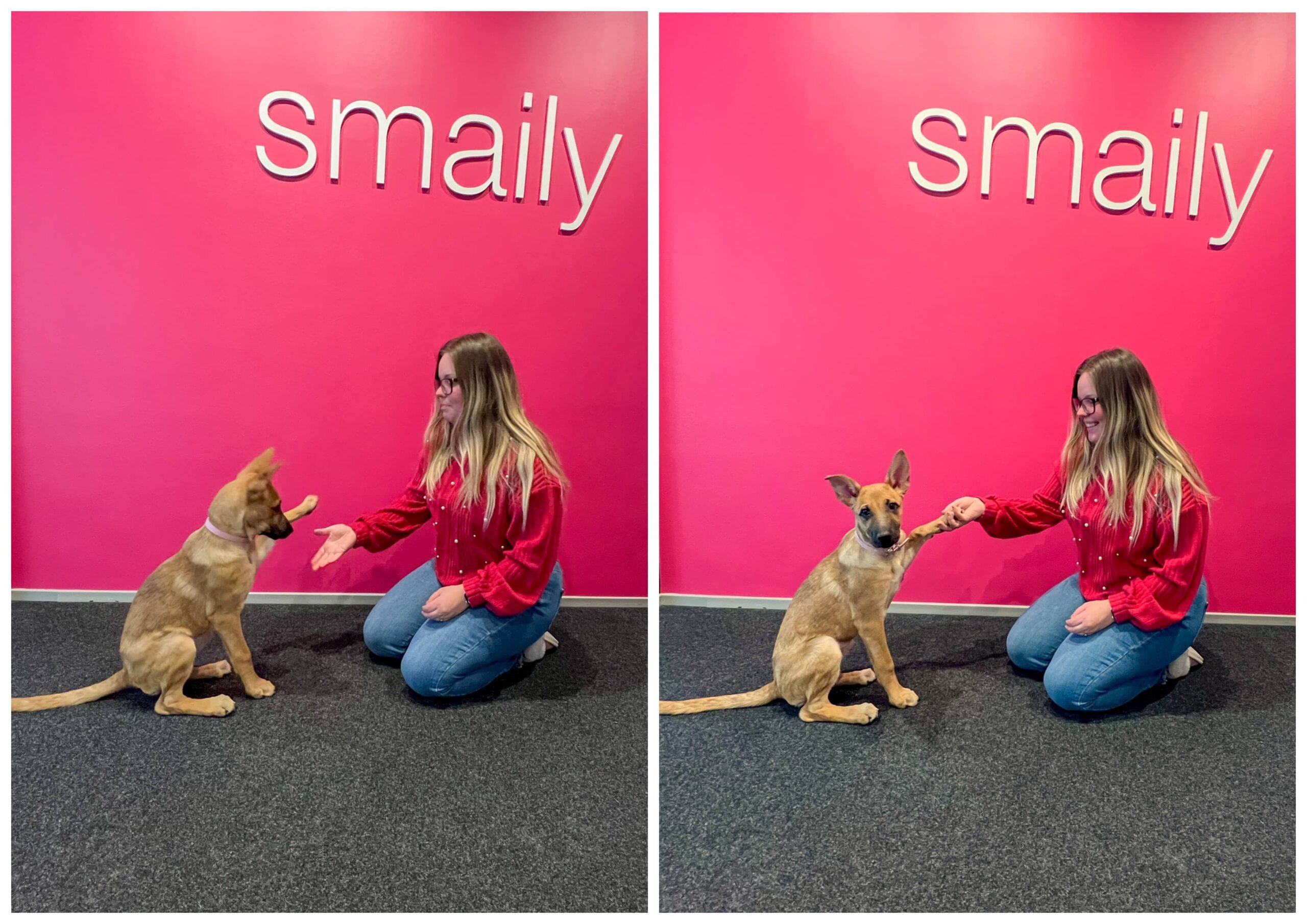
Speaking of images with a human touch, why not add a little individual tinge to your marketing email? By this, we simply mean taking a photo of something going on at your business and adding it to your email to enrich the narrative. The most important thing is the story behind the photo, so sometimes it’s okay if your visuals are not taken by a professional photographer and polished to the last detail in Photoshop. In fact, it can even be a nice change to see a little bit of those rough yet charming natural edges in marketing content.
An example? Add a picture of the greenery visible from your office window to your monthly newsletter, with good wishes for the beginning of spring: “Nature is already sprouting outside our office window! Similarly, we also have new seasonal discounts emerging.” As another example, you can post a picture of how the last visitors had a lot of fun in your pottery workshop (with the permission of the people in the picture, of course) or what a happy working day looks like in your company’s customer service department. This also gives readers the opportunity to peek behind the scenes of your business, letting the customers warm up to your company and bringing its products and services closer to them. An additional reason for using this approach lies with the younger generation. Namely, among Gen Z and younger generations, hyperrealism and a more authentic approach are preferred and fashionable than clichéd and overly luxurious fashion images.
Laughter in Lens: Using Humorous Images in Email Marketing
Injecting humor into the visuals of your marketing emails, be it through playful product photos or amusing lifestyle images, can be a game-changer. When done right, this approach resonates with audiences by making their day brighter and your brand more memorable. Humor can be particularly effective in campaigns aiming to appear approachable and light-hearted or when introducing novelty products. However, caution is key – avoid humor in sensitive contexts or with audiences that might prefer a more serious approach. Remember, laughter can be a powerful connector, but only when it aligns with your brand voice and customer expectations.

Graphic Inspiration: The Power of Graphic Design
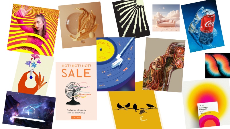
We can’t count this chapter complete by listing different types of visuals and leaving the obvious without a mention. Graphic design-based imagery has always been popular and effective in capturing a reader’s attention. Well, in reality, its importance in all spheres of marketing is undeniable. One of the main benefits of including graphic design-based imagery in your marketing emails is that it can help convey your company’s personality. And it gives you relatively free hands, as you can accentuate or imagine whatever you wish. Graphics can also help to break up text-heavy emails and make them more visually appealing, which in turn makes engaging with your content easier.
Graphic design styles range from the ornate patterns of Victorian and psychedelic design to the clean lines of modernism and the visually layered, depth-enhanced beauty of dimensional design. Paid software options for graphic design include Adobe Creative Suite, Sketch, and Figma (the latter also has a free version, but it is not suggestible for professional design work), while free alternatives include Canva (which also has a paid version), GIMP, and Inkscape. Simpler editing jobs can also be done online, for example, on sites like Photopea, Fotor, or Pixlr.
If you have an in-house designer, it’s easy to get graphic design-based imagery for your marketing emails. Well, of course, the ease of this for the designer depends on how grandiose your wishes are. You can work with your designer to create custom graphics and images that align with your brand’s tone and messaging. Alternatively, if you don’t have an in-house designer, you can work with a freelance designer or a design agency to create graphics that meet your specific needs.
There aren’t many cases where imagery based on graphic design can’t be used, as the possibilities of how they can look are endless. The key, as always, is to remember the purpose of your email. For example, if you’re promoting a serious or somber topic, such as a charity drive for a disease, then bright and flashy graphics might not be appropriate.
Bonus tip: GIF images can also be used to add movement to an email (read more about them in our article here). They can be created on Canva or many free sites such as Giphy and Ezgif.
Different Visual Language of Images
In addition to what is depicted in the photo, the overall visual tonality of the image is also significant. Characteristics such as the color scheme, the softness or sharpness of the shapes, the level of detail, and other components all play a role in conveying the final message. All in all, it is essential that the visual language of images aligns with the brand, is consistent with the advertised product, and resonates with the target audience.
Is your image memorable? Let’s explore how specific characteristics of an image can ensure it leaves a lasting impact on your audience.
Colors Quickly Define Perceptions
Colors in marketing emails are more than just visual “elements” – they’re psychological tools that can evoke emotions, shape perceptions, and drive actions. The palette chosen for photos and imagery sets the mood for the entire email, influencing how subscribers interpret the message. Let’s understand how different color schemes can either work wonders or put a hex (pun intended) on your brand through imagery.
- Lighter tones
Lighter color schemes radiate freshness, openness, and cleanliness. Ideal for brands that want to project approachability and simplicity, these schemes can make designs feel more spacious and less cluttered. Some famous brands that use lighter tones in their branding include Apple, which uses white as its signature color to convey a sense of simplicity and ease of use. Other brands that use lighter tones in their branding include wellness and hygiene brands such as Dove, Colgate, and Johnson & Johnson, which use white to convey a sense of purity and cleanliness, and Airbnb, which uses white to create a sense of comfort and relaxation. However, using only lighter tones might lack the visual impact necessary for more dramatic, stern, or luxurious branding.
- Darker tones
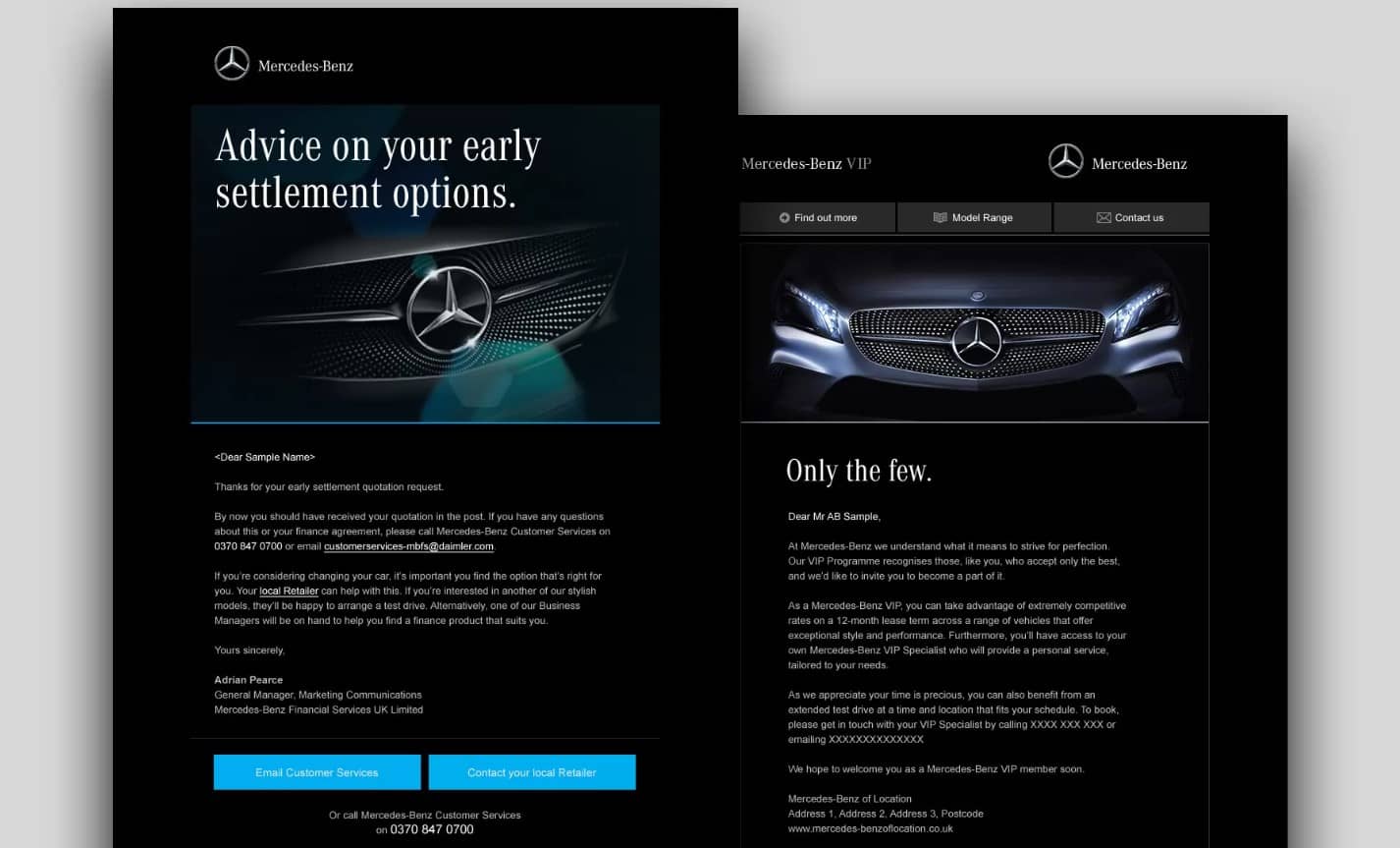
The use of darker color shades in marketing visual language and imagery can be good for a variety of reasons. Firstly, it can convey a sense of sophistication and elegance, as well as a feeling of luxury and exclusivity. Darker tones can also create a sense of mystery, which can be effective for products that are meant to be seen as unique or rare. In addition, darker colors, such as black, can create a sense of power and authority, which can be effective for brands that want to convey a sense of dominance or leadership. On the flip side, darker tones may also be perceived as somber or heavy, potentially deterring brands aiming for a lighter, more accessible image.
Some famous brands that use darker colors in their marketing include Gucci, which incorporates rich, dark tones in marketing to evoke a sense of sophistication and high fashion. Luxury car brands such as Mercedes-Benz, BMW, and Rolls-Royce also use darker tones in their ads to convey a sense of power and exclusivity. Other brands that use darker tones in their marketing include high-end fashion brands such as Gucci and Prada, as well as tech companies such as Samsung or PlayStation.
- Black and White
Black and white imagery exudes timelessness, sophistication, and clarity. Ideal for brands looking for a minimalist or classic appeal. Renowned for its use of black and white, Chanel emphasizes everlasting elegance and simplicity in its marketing. Nike also frequently uses black and white in marketing, especially in email campaigns, for a classic, versatile, and strong visual impact. An interesting example is also the Leica Camera, which leverages black and white photography in marketing to reflect the brand’s heritage in photography and to emphasize the quality of its products. While black and white visuals can help get your message across more concretely, the lack of color could be perceived as a lack of vibrancy, making it potentially unsuitable for more lively, playful, or youthful brands.
- Pastels
Pastels are synonymous with calm, elegance, and subtlety. These soft colors are excellent for wellness and self-care products (like Only Good), luxury brands (like Tiffany & Co.), or any brand aiming for a tranquil, sophisticated vibe. Pastel colors are likewise a great choice for branding products that are targeted towards children and younger people. However, if not used appropriately, pastel tones risk being perceived as dull or lacking in energy.
- Brightly Colored
Bright colors often resonate with vibrancy, energy, enthusiasm, and positivity. They’re apt for brands that want to exude youthfulness, innovation, or festive vibes. On the other hand, excessive brightness might seem unprofessional or frivolous, making it a tricky choice for brands with a more serious or sophisticated demeanor. Brands from various sectors utilize vibrant colors in their (email) marketing and branding, for example, Spotify reflects the energy and diversity of its music and podcasts through bright color combinations. Since many companies use bright colors in their marketing, there are many examples to choose from. Some famous examples include Instagram, McDonald’s, Sephora, LEGO, and more.
- Playing on Contrasts
High-contrast color schemes capture attention, creating vivid focal points. Psychologically, they generate excitement and evoke energy. This works well for brands aiming to emphasize boldness and vitality. No wonder the fashion-conscious often like to combine opposites from the color wheel in their outfits, as it catches the eye and is visually pleasing. Still, it must be mentioned that using overly contrasting colors in your marketing might come off as aggressive or jarring, potentially alienating some subscribers, so be mindful of your boldness. A neon green discount sign on a red background? Rather not, this shopping spree promises to become too stressful.
- Monochromatic Shades
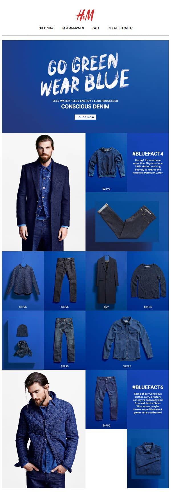
Using varying shades of a single color can create depth and visual interest. Also, it helps indicate a precise theme. This strategy can evoke specific emotions tied to the chosen hue, amplifying the brand’s message. While it showcases unity and coherence, a monochromatic palette might not be diverse enough for brands looking for a broad appeal. This said, the given tactic can work for a variety of specific campaigns that are thematic – such as the H&M example below.
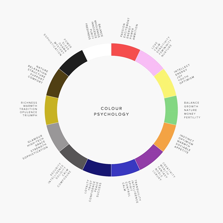
Of course, different colors carry specific meanings and evoke various emotions. It’s fascinating to note that color psychology plays a crucial role in consumer behavior; for instance, studies have shown that up to 90% of snap judgments about products can be based on color alone. See the picture below to delve deeper into the symbolism of different hues.

The Impactful Voice of Shapes
Visuals communicate faster than words, and shapes within those visuals can set the tone, sometimes even before the color or content registers. Take, for instance, soft, curved lines and shapes. These often evoke a sense of calm, tranquility, and flow, just like the gentle steam rising from a cup of soothing oolong tea or the delicate pastel clouds backdrop in a spa ad. It’s not just about presenting the product but also invoking a certain feeling that aligns with the product’s ethos.
In contrast, sharp zig-zags or angular patterns convey energy, urgency, and action. Picture an advertisement for a shoe clearance sale: the dynamic interplay of fuchsia pink with bright yellow, interspersed with zig-zag lines, not only captures attention but also instills a sense of urgency. It’s as if the shapes and colors are nudging the viewer, saying, “Hurry, before it’s too late!” Yet, it’s essential to use these elements appropriately. Incorporating conventional discount patterns or overly vibrant colors in an ad for a serene health center might jar the viewer, making the message seem out of place and causing subconscious thoughts that the massage there can be just as sharp.

Subtle Signatures: The Power Symbols
The entirety of each picture tells a story, but often, it’s the barely-there details that create the most rich narratives. While primary visuals, like products or people, grab our immediate attention, these subtler symbolic elements resonate on a more subconscious level, influencing our perception and behavior more than we might realize.
Want examples?
Consider the addition of a simple clock in an advertisement image. On the surface, it might seem like just another element. However, its presence subtly conveys the fleeting nature of time, adding a sense of urgency. It hints that the offer is temporary, urging the viewer to act promptly. Similarly, imagine a promotional image for a travel package. While the main visual might depict a pristine beach, a small airplane icon in the corner could remind viewers of the journey, the adventure, and the escape from their routine. Now think of a financial service ad with a primary image of a confident advisor. The inclusion of a tiny upward-pointing arrow or a miniature rising graph might reinforce the idea of growth, prosperity, and positive results. Such symbolic details hold significant influence. They can amplify the core message, stir emotions, or even instill specific values or ideas associated with a brand.
Last but not least, a company’s most recognizable symbol is undeniably its logo, and creativity can elevate its presence. For instance, an outdoor gear company might subtly shape clouds in the backdrop to resemble its logo, hinting at its brand without overtly showcasing it. Or, a chocolatier could mold their treats to mimic their emblem’s curves. Incorporating these elements thoughtfully can enhance the depth of your marketing visuals, crafting a more nuanced and layered narrative.
Minimalism – A Good Change to Modern Noise
Let’s be honest – most of us actually live in an unnatural setting for human beings. The bustling urban landscapes, coupled with the endless streams of online data, often become overwhelming. Yet our brain, a marvel in itself, can (mostly) distinguish the unnecessary from the necessary, allowing us to escape a very large part of the noise. Consider a city stroll. Your brain smoothly tunes out the humdrum of passing vehicles, chatter, and shifting weather. If the brain did not save us from such an orchestra, there would surely be significantly fewer pedestrians. However, people can’t escape this clutter when opening channels that mediate advertisements, and this includes the mailbox.
Therefore, treating our subscribers with a simple and minimalist design in our emails is more than welcome. Minimalist designs not only stand out but also resonate, offering clarity and directness that’s both refreshing and effective. Especially for brands that champion simplicity, efficiency, or modernity, this design philosophy can amplify the core message while reinforcing brand identity. Whether you’re a tech startup promoting sleek products or a wellness brand advocating for a decluttered life, minimalism in your visuals can be a powerful tool. It can’t be denied – there really is a charm in simplicity.

How About the Richness of Maximalism?
Minimalism has been heralded for its simplicity, but there’s an equally compelling counter-movement: maximalism. This design philosophy invites us to indulge in a sensory feast, embracing the complexity and intricacy of the world around us. Think of a bustling marketplace where every corner and stand presents a story, a color, a sound, or a scent. While minimalism seeks clarity through reduction, maximalism finds clarity in the abundance of detail, offering depth and layers of meaning. And sometimes, we all dream of living life to the fullest, right?
Using a maximalist approach in your email visuals can be a bold statement, captivating your subscribers with rich imagery, vibrant colors, and intricate designs. It’s a celebration of excess, allowing brands to showcase their creativity, innovation, and uniqueness. For companies that thrive on diversity, luxury, or artistic expression, this style can resonate deeply, creating immersive experiences that promise to enter the viewer’s life for real. Whether it’s the email marketing of a fashion brand showcasing a mosaic of patterns or promoting events with messages, maximalism can be the key to crafting unforgettable email narratives. Remember, in a world where abundance can be a virtue, more might just be the magic touch.
Symmetry: All Is as It Should Be
Somewhere between minimalism and maximalism lies an intriguing design technique: the use of symmetry in images in email marketing. Symmetrical images, whether product or illustrative, create a sense of balance and harmony, which can be psychologically pleasing to viewers. This equilibrium in visuals can subconsciously signal order and stability, evoking a sense of trust and professionalism in the viewer’s mind. Furthermore, symmetrically composed photos can guide the viewer’s eyes toward the central point of the image, often where the key message or product is featured. This strategic placement captures attention and reinforces the email’s core message, making it more memorable and impactful for the recipient.

Beyond Reality: Using Surreal Imagery
In the vast expanse of conventional email visuals, a touch of surrealism can act as a refreshing oasis. Surreal imagery, characterized by unexpected juxtapositions and dreamlike scenes, can instantly captivate the reader’s attention, making them stop, ponder, or laugh and remember what they saw. For example, who among us doesn’t remember Old Spice’s surreal, bizarrely scripted TV commercials?
Why does it work? Our brains are naturally drawn to the unfamiliar. When we encounter something that doesn’t fit within our usual understanding of the world, we’re compelled to understand it. Thus, by integrating surreal elements into your emails, you’re not just showcasing a product or message but offering a mini-adventure for the mind. Imagine promoting a new brand of coffee with an image of a giant coffee bean floating above a city, casting daybreak over the sleepy town. Or perhaps, for a travel agency, a suitcase sprouting wings, ready to take flight. These unconventional visuals pique curiosity and create a lasting impression.

Exercise caution, though. Surreal imagery, while powerful, might not align with every brand’s identity or message. For instance, a financial institution aiming to project reliability and trust might want to steer clear of too much whimsy. In this case, it may be better to offer concreteness and expected stability, as no one wants to associate their finances with unexpected scenarios.
If your company’s field of activity allows for a more creative approach, you can test the use of surreal visual language and show subscribers that not everything they open in the mailbox is predictable.
Crafting a Visual Voice with Typography
In the intricate dance of email marketing, typography often plays a subtler yet pivotal role. Just as every image tells a story, the choice of font style, size, and placement within a photo or graphic can dramatically amplify your message. Why does this alchemy of typography within photos work? In a realm where every email is awash with text, typography in images stands out. It marries the visual and the verbal, ensuring the viewer’s attention is split no more. It also imprints a more unforgettable memory as the brain processes the image and its embedded message as a single, cohesive unit. So, while it’s true that every picture speaks a thousand words, with the right touch of typography, it might just convey the precise thousand words you intended.

However, while creative typography can enhance many marketing emails, it’s not a one-size-fits-all strategy. For brands with a more serious or professional demeanor, overtly artistic fonts might seem out of place. Also, take into account that your readership may consist of people who speak different languages – would they all understand the text on the image? Finally, the most important point about typography used in an image is that if you decide to use it, do it modestly! Keep in mind that you do not overload the picture with text and that you place the most crucial information in the email body, not embed it within an image. This is because, unfortunately (especially in the context of this article), not all people see pictures in their mailboxes.
The Technical Aspects of Images in Email Marketing
There are also several technical things to consider when using images, such as the recognition above that not all people will see them in their inboxes. We have discussed various styles of images that would suit different lines of businesses and brands with various style languages. To summarize the article, we will delve into the technical aspects of visuals, starting with different pages where you can find images in various styles. Most importantly, we will list mistakes to avoid when adding images to your marketing emails.
Using Stock Images
Suppose you don’t have a photographer to create your own illustrative (non-product) images, and you still want to decorate your marketing email with something. In this case, there are plenty of paid and free options for finding beautiful photos and graphics online. When using stock photos, we’ll give you a small recommendation – don’t immediately put the first picture that comes up in the “most popular” category after you click the search button. As image banks are widely used, readers may have already come across your image in an advertisement or a news website. This kind of repetition adds an insincere or even cheap or tacky feel to the overall impression of your email, regardless of the niceness of the image itself.
Several paid image banks offer high-quality photos and graphics for marketing, each operating on various payment models. Getty Images, Shutterstock, and iStock are popular choices, often working on a subscription or per-image payment basis. Integrated with Adobe Creative Suite, Adobe Stock offers subscription and credit purchase options. Depositphotos and Alamy are also good examples with their extensive libraries. While these premium options ensure quality and variety, free image banks are also available for those on a tighter budget.
Some good examples of free image banks:
- Freepik – Offers a wide range of free images with advanced search filters. It limits daily downloads, but you can create an account and organize and save images into custom collections.
- Pixabay – A vast library of free images, vectors, and art illustrations, known for its user-friendly interface and a wide array of choices without download limits.
- Unsplash – A highly popular image bank where artistic photos are provided by a community of photographers. This is ideal for unique and aesthetically pleasing imagery.
- Needpix – Royalty-free images and vectors, great for straightforward, no-frills image sourcing.
- Pexels – High-quality and contemporary photos and videos, all free and easily accessible, perfect for modern visual needs.
- Burst by Shopify – Tailored for entrepreneurs and businesses, Burst provides free stock photos that are particularly useful for e-commerce, with many images depicting business scenes, products, and lifestyle shots.
The list could go on about sources from which to get stock images, and for further research, you can look at a good summary article by Fuze Branding, where recommendations are given in the categories of different business fields. The final and most important note is that whether you get images from paid or free image banks or other sources, always ensure you have the right to use an image in your email campaigns to avoid legal complications.
Exploring AI?
Nowadays, the use of artificial intelligence (AI) in image creation has also become a big topic. Thinking in the context of email marketing, there are uses, but not for every type of image. For example, AI is of great use when it comes to creating images of the surreal kind. Also, artificial intelligence can be used to simply create a background in a desired color scheme, and with specific shapes and elements. You can use this background later on to add your product image or message with typography unique to your brand. However, AI can’t yet create the “je ne sais quoi” of a real photo (and should it?) – its capabilities are limited in this regard. For instance, photos of the employees of a company or a real product can’t be replaced with AI’s creation, just as AI-generated text cannot replace someone’s quotes, thoughts, and what people behind the product sincerely want to convey with the brand message.
Make sure that any AI-generated content matches the overall language of your marketing emails. In addition – to achieve good results, the most important thing is to make sure that the prompts you give to AI are clear and detailed.
Images in Email Marketing: What to Avoid
Images are the immediate attention-grabbers in any email, and they can work as the element that seals the deal. While the right image can work wonders, the converse is equally true. An ill-chosen image can backfire with unintended consequences: not just losing a sale but potentially diminishing subscriber counts and damaging the customer’s view of the brand. If you’re not sure which elements to choose, A/B testing can be used to determine which of your photos work best for the email and product by effectively driving sales. Below, we’ve listed the primary things to avoid when it comes to adding images to your marketing emails.
Steer clear of the following:
- Forgetting to Add ALT-Text to Images: We’ll start off with this, as it has become crucial. ALT-text ensures that even if the image doesn’t load or if the recipient uses a screen reader, they can still understand the content or intent of the image.
- Low-Quality Images: It’s obvious and reflects poorly. A grainy or blurry image can immediately cast doubts on the professionalism and care behind the entire email. A potential customer might think that if you can’t even create a decent-quality email, then your product probably isn’t reliable either.
- Overly Large Images: A massive image can slow down the loading time of the email, frustrating the user and potentially leading them to abandon it before even viewing it. If you need to use a specific image that’s still large in file size even after resizing, consider using online image compressors (e.g., Compressor.io). These tools can reduce the image’s file size without notably compromising its quality.
- Too Many Images in One Email: Adding too many visuals not only slows down the email loading time but also overwhelms recipients by making them lose focus on the message you intend to convey.
- Overly Busy Images: Unless you’re dabbling in email marketing gamification and entertaining your subscribers with a “find in the picture” game, an overly cluttered image doesn’t do you any favors. Instead, it distracts and confuses the viewer.
- Poorly Placed Images: Read (and look at) your email when sending a test to your inbox. Check whether the images are arranged logically and whether the text and images support each other.
- Irrelevant or Outdated Images: Ensure the images align with the theme of your marketing email, the season you’re in, and current events. Similarly, it’s not the best to use images with topics that are becoming outdated or have tired people out.
- Socially Unacceptable Images: This is self-explanatory in any medium. Steer clear of offending anyone and avoid rudeness, vulgarity, or other inappropriate content. Avoid symbols and details associated with negative or controversial issues. Don’t include images that could be misunderstood because of any symbolism, color combination, or other element used in it.
- Colors That Don’t Align With the Brand: It’s advisable to maintain brand consistency. Straying too far from your brand colors can confuse the reader or dilute your brand’s identity.
- Images that clash with each other (and the content of the email): For example, your primary message is about the importance of Christmas warmth, and you include a cozy picture of a family in a dimly lighted room, enjoying quality time by the Christmas tree. Still, you want the recipient to check out your seasonal discounts, so include a neon-colored stock photo that shows a person in a Christmas hat making a wild face while holding a sign that says “Discount frenzy!“. The email opener might not have time to delve into the text at first, but they will instantly notice the inconsistency of the images. Thus – words left unread, the credibility of your message will become nearly non-existent.
- Overly Edited or Manipulated Images: A touch of surreality can work wonders in some forms, but when it comes to realistic photos with people, it’s best to steer clear of over-editing. While some touch-ups are okay, avoid using images that appear heavily photoshopped, as this can make them seem inauthentic and fake. And well, rightfully so.
- Ignoring Mobile Optimization: Ensure images look good on all devices, mobile view included. A majority of users check emails on their phones, so an image that doesn’t resize or display correctly can hinder the message.
- Not Testing Image Display Across Email Clients: Images may display differently across email clients (e.g., Gmail, Outlook). Always test to ensure consistency.
In Conclusion: Picture a Perfect Email
What color would you paint your walls? What mood do you want to offer your guests? How do you want to invite others to gladly embrace your identity, and what do you have to give to the world? Why am I asking these questions?
Take a little journey and think about these questions when designing your company’s messages to choose each image and design element purposefully. The possibilities are endless for images in email marketing, from candid product photos to implicit symbolism and surreal storytelling. After all, external and internal visuals largely construct our worldview, so use inviting imagery in your marketing emails to turn simple viewers into brand residents.